Brush Romans webinar with John Downer and Paul Herrera
On March 11, 2014, FontLab hosted a webinar on Roman capital letterforms and their origins in flat-brush writing. Sign painter and type designer John Downer presented alongside calligrapher Paul Herrera.

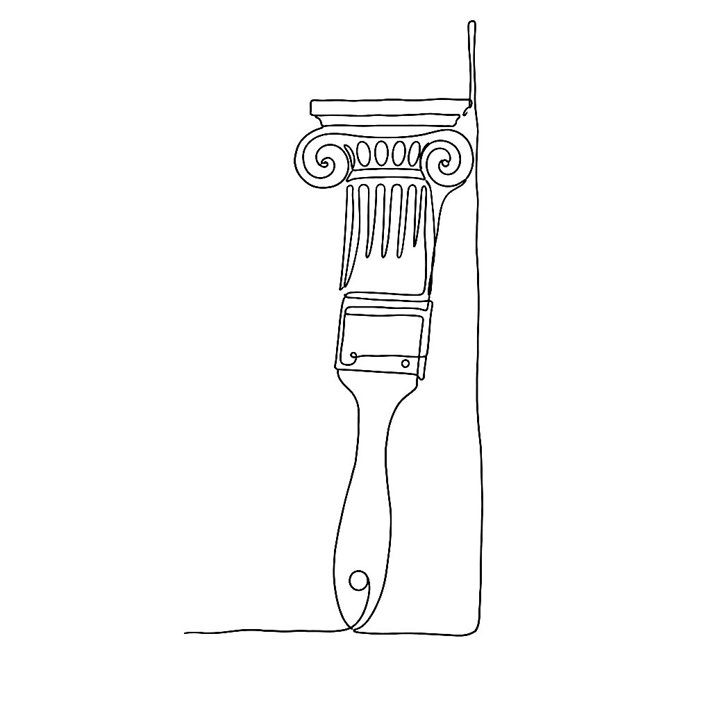
The session demonstrated how the structure of Imperial Roman capitals traces back to marks made by a flat brush on a vertical surface. These letterforms underpin most Western type design. Downer used a live brush demonstration to show how the tool’s geometry generates the defining features of the classical Latin alphabet:
- Thick-thin stroke contrast
- Serif terminations
- Proportional relationships
John Downer has worked as a journeyman sign painter for over forty years. He began designing typefaces thirty years ago. He approaches letterform design through professional hand lettering rather than historical models alone. His typefaces include Brothers, Roxy, Iowan Old Style, and Vendetta. Each carries structural decisions traceable to his sign-painting practice.
Paul Herrera trained under Reverend Edward M. Catich starting in 1967. Catich was an inscription cutter and calligrapher who developed theories on the brush origins of Roman capitals, documented in his 1968 book The Origin of the Serif. Herrera worked alongside Catich as an inscription cutter and seminar assistant until Catich died in 1979. He then taught Catich’s classes at St. Ambrose University through 1989. He served on the faculty of five international calligraphy conventions between 1981 and 1987. He continued inscription work for Wichita State University and architectural clients over a forty-year career.
The webinar drew a direct line from historical stonecutting and brushwork to the practical concerns of contemporary type design. It showed how understanding the physical origins of letterforms informs decisions about weight distribution, stroke modulation, and serif construction.