
FontLab Pad 2.1: free typesetting app that lets you use every font and every glyph
FontLab Pad 2.1 adds OpenType feature controls and other improvements. And it’s still free for Mac and Windows!
FontLab Pad 2.1 adds OpenType feature controls and other improvements. And it’s still free for Mac and Windows!
You found a font you love, and your app is showing you a fraction of it. With FontLab Pad 2 you try the font without installing it, set your headline exactly the way you want it, and paste the result into whatever you are working in. Pad has been free for ten years, and it still is!

Your variable font holds hundreds of styles. Word shows you nine. Some apps show you one. Drop it into TransType 5, add any instance you want, click Convert: every style lands in your font menus, ready to use. 10 conversions are free!

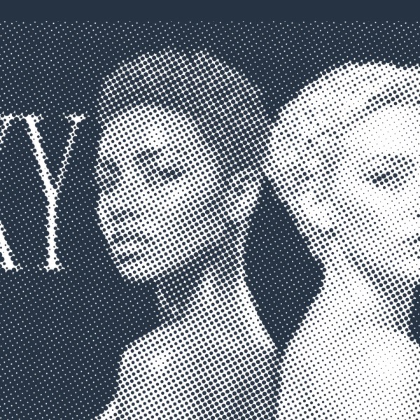
Vexy Playlines turns any photo into vector art in the browser: drop an image, pick one of fourteen algorithmic fills, from classic linear or dotted halftones, to stipple, low-poly, wireframe, ASCII. Drag a slider or two, export SVG! Five fills are free with no sign-up, nothing to install; nine more unlock with a FontLab Pass. Try the quick little cousin of our Mac and Windows Vexy Lines app — built for the ten-minute detour that eats an afternoon.
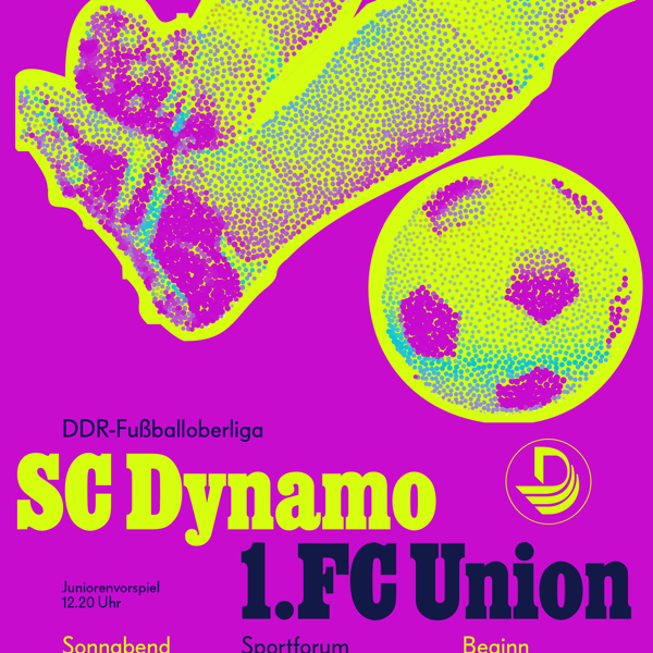
In 1977, Albert Kapr squeezed poster style out of cheap GDR paper and a one-colour press. The Vexy Lines case study: retro poster scans his SC Dynamo sheet, rebuilds the halftone photo into a vector signal where stroke thickness answers to luminance, and pours one photograph into three posters: faithful linear, colour-soaked, and full brutalist for the scrolling feed.
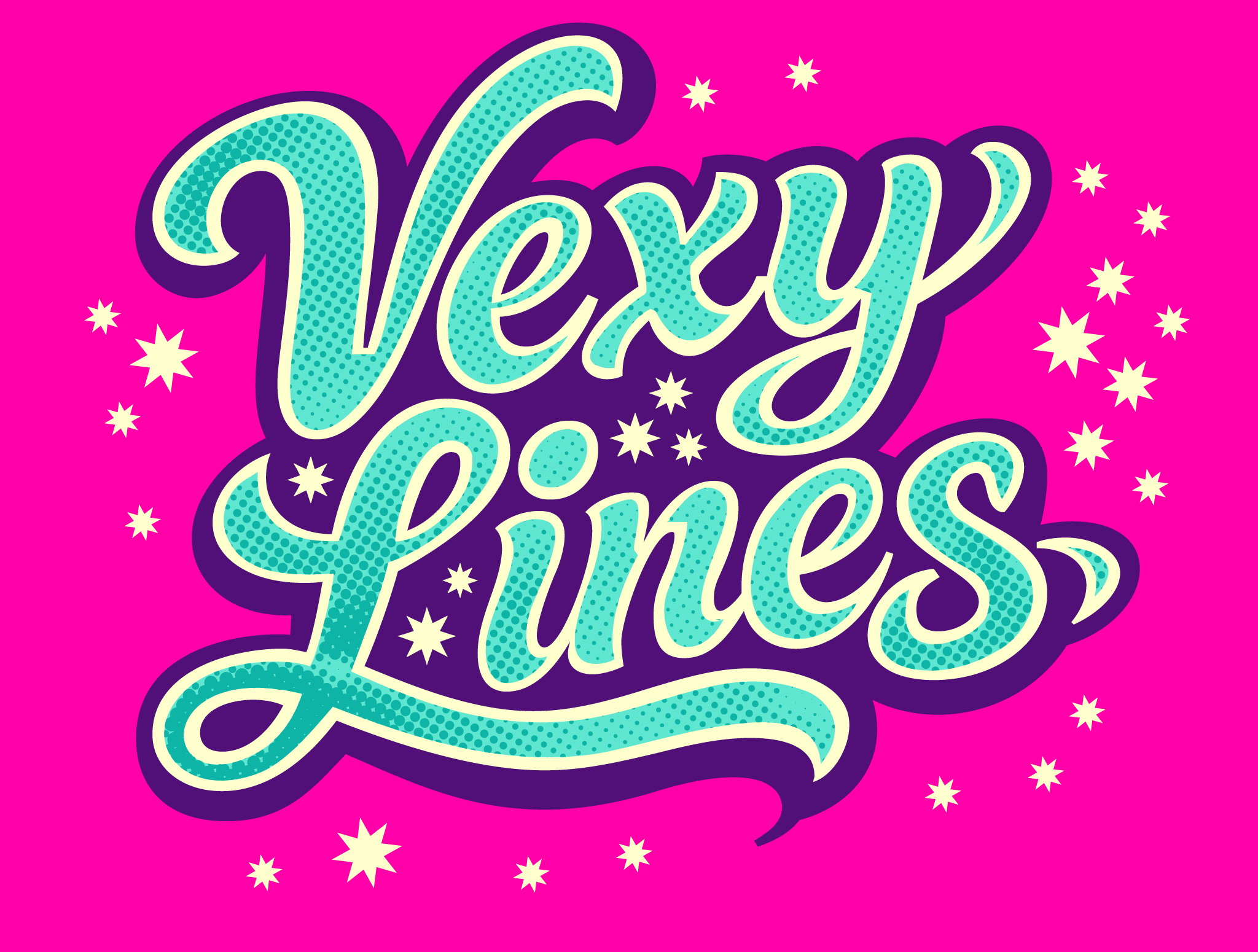
Airbrushed lettering dies at the vinyl cutter: no edge to follow, no colour to separate. The Vexy Lines case study: lettering rebuilds the glow as flat vector structure: halftone stars sized by brightness, masked outlines, hand-tuned Béziers. The result cuts cleanly at 2 meters, separates to spot colours, and stays editable the whole way.
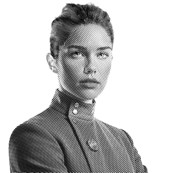
Many headshots, many cameras, one team photoshoot: with Vexy Lines, you can turn low-quality photos into visually harmonized, crisp SVGs & PDFs. Turn your starship crew into WSJ-style hedcuts or brutalist stipples, and showcase them from avatar to hero. This look is worth every penny!
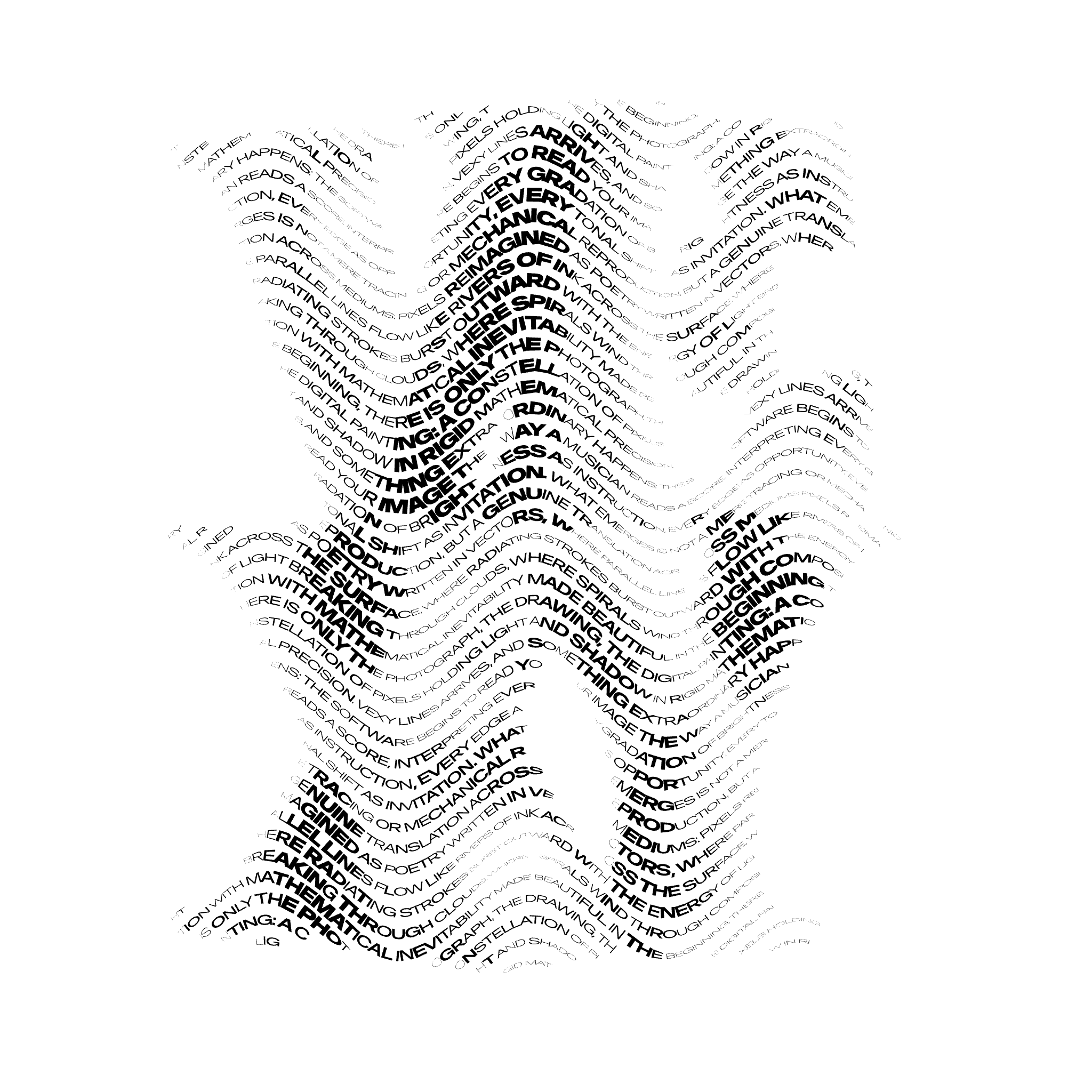
With Vexy Lines, you can make the most of your variable fonts. Create expressive typographic arrangements, impactful headlines and font specimens. Check out the Vexy Lines case study: Text fill! It typesets your text along the baselines created by the app’s procedural patterns. Each text glyph picks its font size or variable font instance from the brightness of the image beneath it. Sampled per glyph. Mapped to Weight, Width, Optical Size, or any other axis. Exported to SVG & PDF. For foundries who want to show their design spaces flow along pixels.
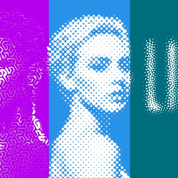
In October 2025, we launched Vexy Lines, a Mac & Windows app that redraws any photo as editable vector line art: engraving, halftone, stipple, wireframe, even live variable type that reads the image beneath it. We just revamped the vexy.art/lines website, which now includes real-life case studies.
Say hello to Vexy Lines 2, with all-new image filters, a stroke-cutting sharp mask, cross-hatching diamond dots, organic wobble & rough strokes, much faster parameter tweaking, and hundreds of other improvements. If you have Vexy Lines 1, it’s free!
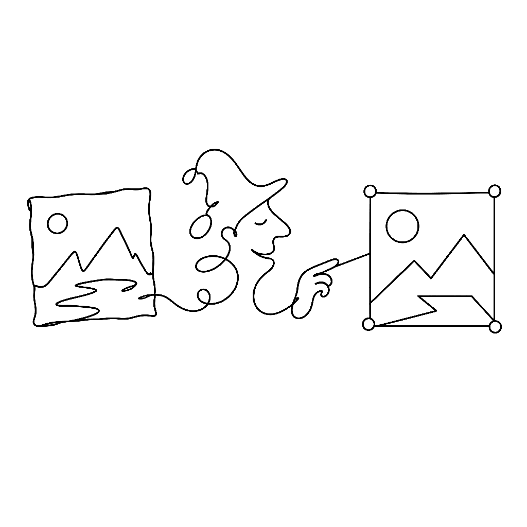
A photograph is not a vector. A sketch is not a vector. A scanned logo is definitely not a vector. Vexy Lines exists to fix that, one image at a time.
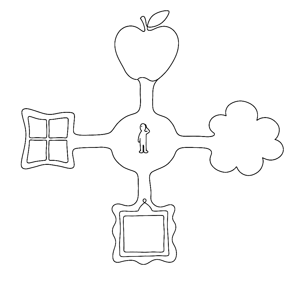
In 2013, color OpenType looked like a standards argument with four exits. Apple had sbix. Google had CBDT/CBLC. Microsoft had COLR/CPAL. Adobe and Mozilla had SVG-in-OpenType. The question then was which proposal would win. In 2026, the answer is less tidy and more useful: they all became real OpenType color font formats, but they did not become equally useful everywhere.
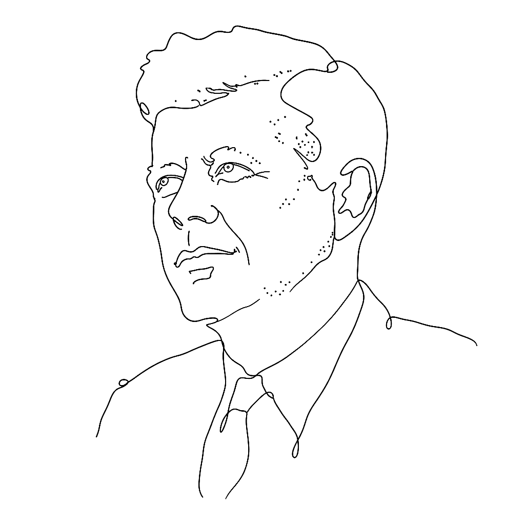
In 1979, a Wall Street Journal illustrator named Kevin Sprouls introduced a stipple portrait to the paper. Forty-five years later, the same form is still running on the front page. That is unusual enough to warrant an explanation.
Nothing gets old faster than a font format — until a client opens a twenty-year-old file and suddenly it is everybody’s problem again.
The generative line has a genealogy. It runs from a physics lecture in 1815 through a children’s toy in 1965 and a university lab in 2001, and it ends — so far — with an algorithm that sold for five million dollars.
The fine-line patterns on a banknote are a security feature. A British engineer made a toy of them in 1965 and sold 30 million units.
Scannerlicker is Fábio Duarte Martins’s foundry, and his testimonial is one of the few that actually names the FontLab features doing the work. It is, accidentally, a short manual on what to learn first.
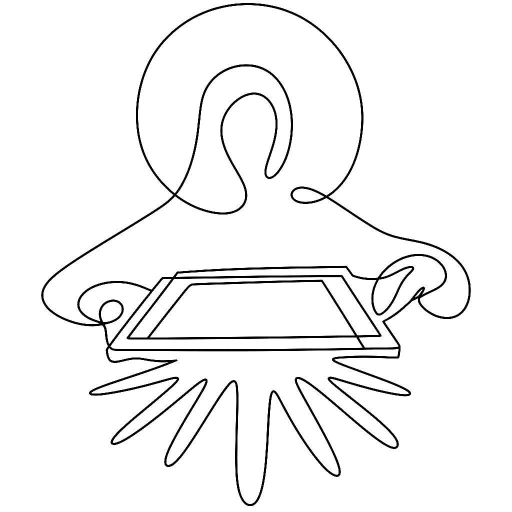
Frances Kent took her students to see Warhol’s Campbell’s Soup show, came back to Immaculate Heart College, and turned supermarket packaging into devotional art.
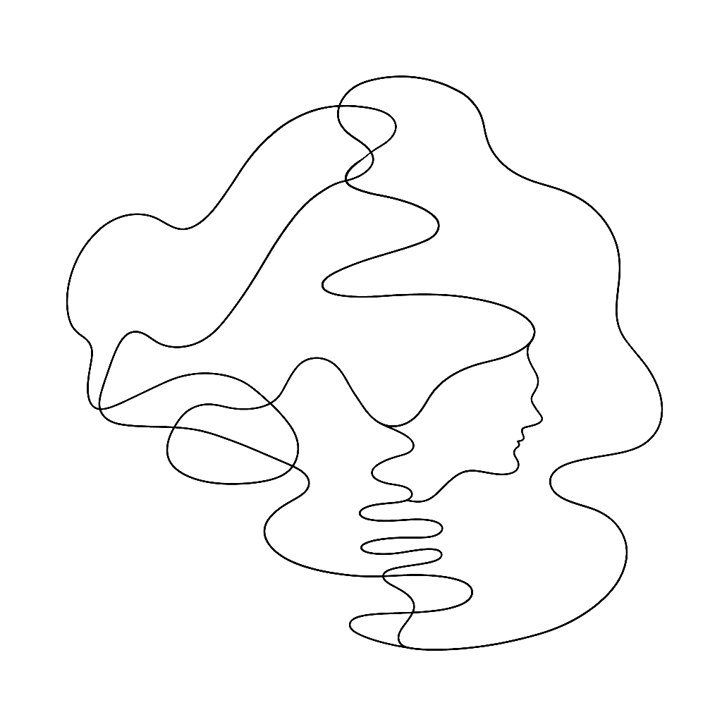
A contour line is a lie your map tells you so you can understand the truth. No hill has a line around it. The line is what you draw when the hill refuses to fit on a flat page.
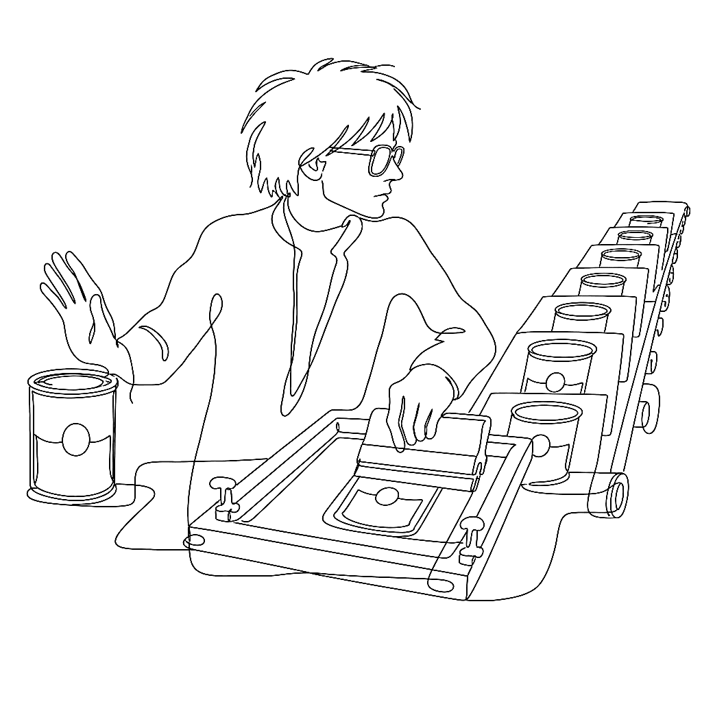
Andy Warhol started screenprinting in August 1962. His explanation: “I wanted something stronger that gave more of an assembly line effect.”
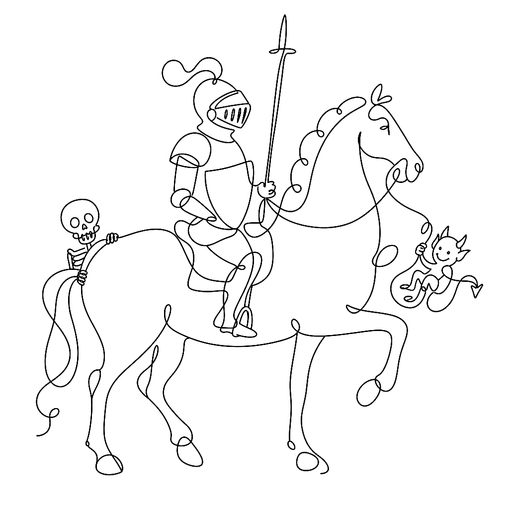
A line can carry tone, texture, shadow, and emotion — and never once pretend to be a photograph. That is the whole argument of five centuries of printmaking, made with a burin, a graver, and eventually a stylus.
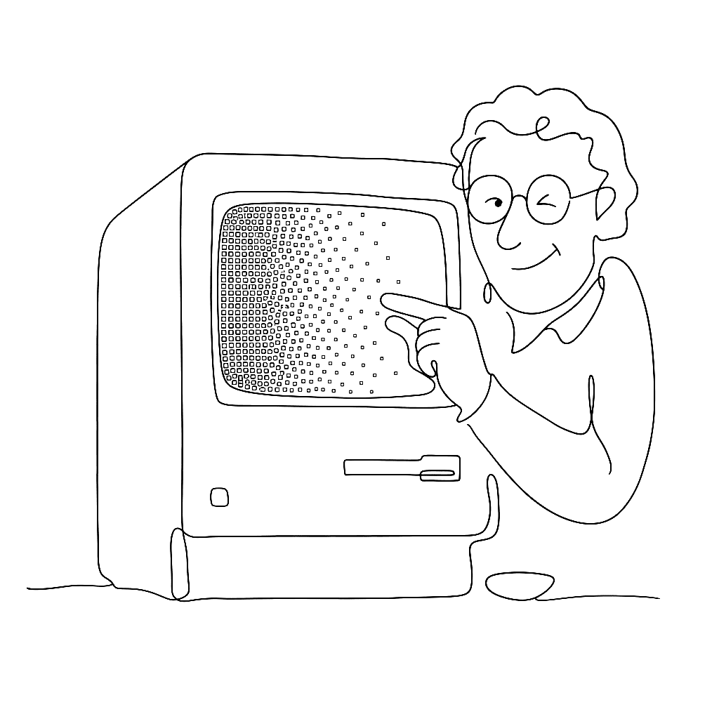
A one-bit display has no grey. Dithering is the sixty-year argument that it doesn’t need one.
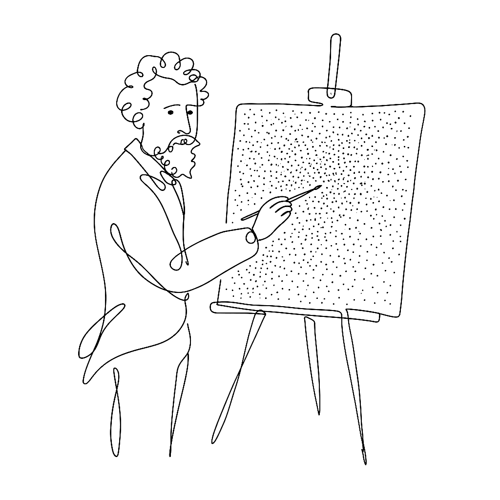
Georges Seurat spent two years applying roughly 220,000 dots to a canvas. The painting works because the dots don’t blend on the canvas. They blend in your eye.
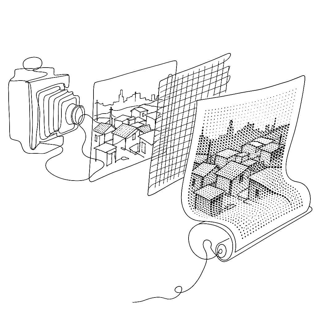
Photography arrived in the 1830s. Printing photographs in newspapers took another fifty years.
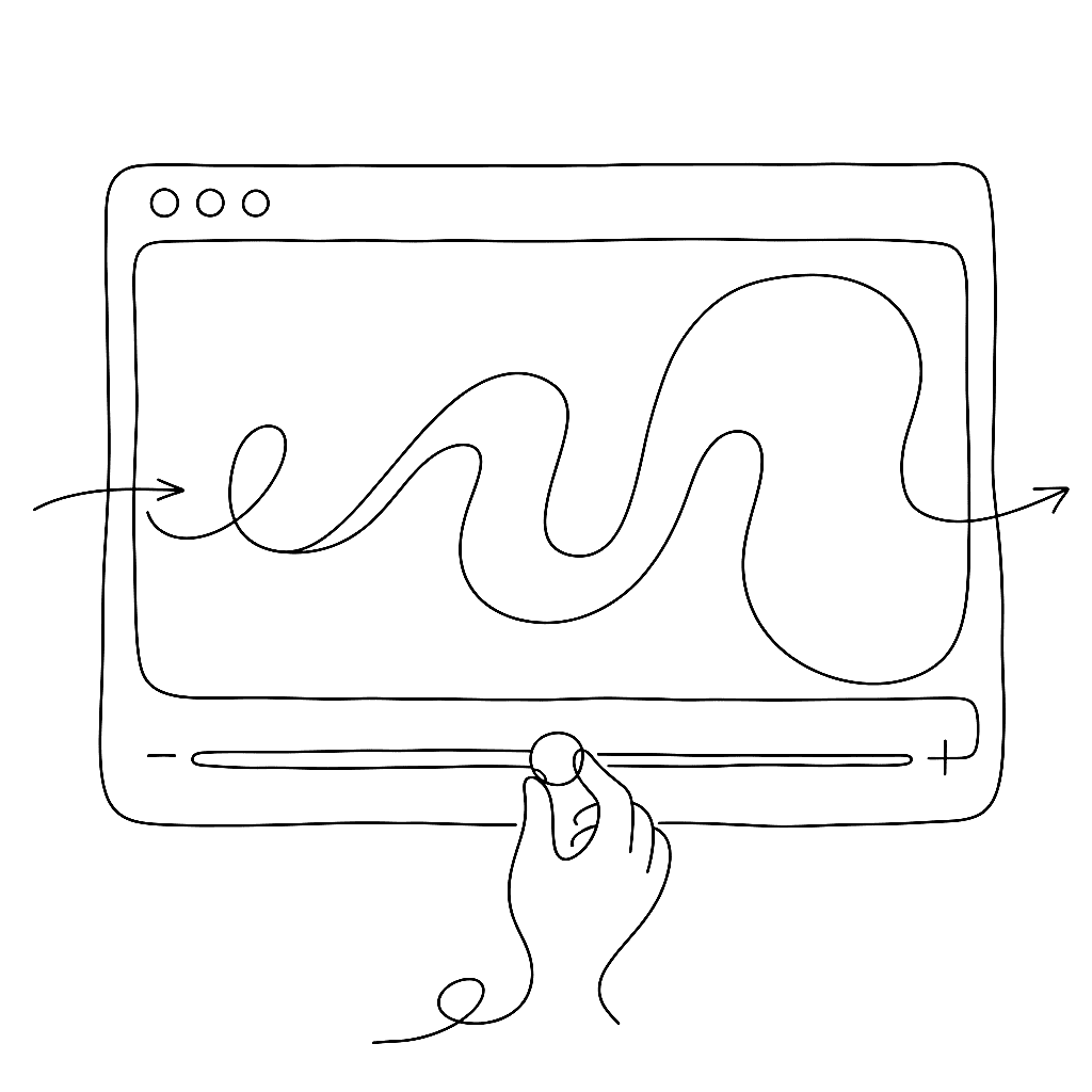
Typography on screen used to mean “pick a weight and hope for the best.” Now the weight can follow the user.
Every OpenType feature — ligatures, kerning, small caps, Arabic joining forms — runs through two tables and one engine. Most type designers know the features exist. Fewer know what the tables look like from the inside.
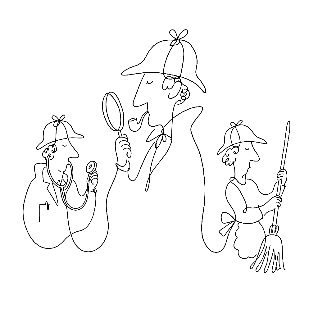
Acqua Aldina is a variable serif drawn by hand. Baker Street 221B is a three-font Sherlockian set with a font for the detective, the doctor, and the housekeeper. Yuri Gordon’s catalogue does not pretend to fit one mood, and he’s open about why FontLab works for the spread.

Most type designers know their fonts will be rendered differently on macOS and Windows. Fewer know the names of the four pieces of plumbing responsible. The names are worth knowing, because the plumbing shapes everything.
The first letter is the hardest. The FontLab TV glyph construction episode is a calm, deliberate walkthrough of drawing one letter — n — from a blank glyph cell to a finished, point-clean contour you can build a font around.
Browsers have shipped robust font-variation-settings support since 2018, and animating those axes works the way the rest of CSS animation works. That is a small miracle, and the people who built it deserve a round of applause.