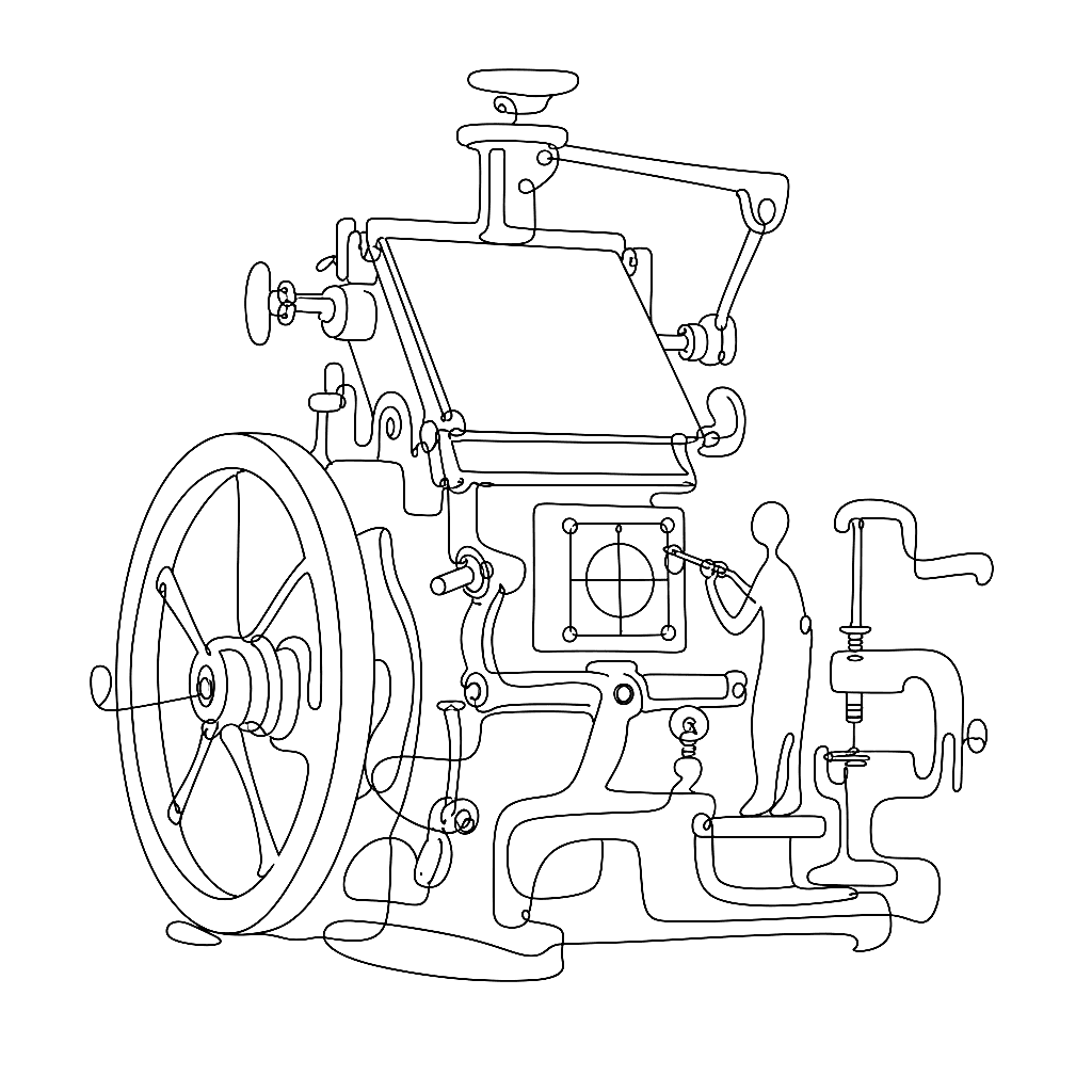
The heavy machinery of FontLab 8.4
Drawing letters for a living turns out to be mostly an exercise in being perpetually disappointed by optical illusions. A geometric circle next to a geometric square at the same height looks smaller than the square. The fix is to draw the circle slightly larger so that it merely looks the same size. Type design is a profession built on quietly lying to the eye so the eye perceives the truth.

A font is not a vector drawing
The standard vector drawing program treats paths as rigid wireframes. Move a node, and only that node moves. This is fine for an icon. It is hopeless for a letter, where every node is in conversation with every other node — the right side of the stem with the left, the top of the bowl with the bottom, the cap height with the x-height with the descender depth.
FontLab 8 treats contours as a system rather than a wireframe. The Power Nudge tool is the headline example: nudge the top of a stem, and the surrounding geometry slides with it to keep the stroke’s thickness intact. The tool assumes you want to keep your verticals consistent, because you are drawing a font, not a potato. Move a node, and the related nodes move in the relations that the typeface has already established.
This is more than a convenience. It is the difference between drawing a letter and drawing a system. The letter is the visible artefact; the system is the rules that make it consistent with the other twenty-five letters. Power Nudge enforces the system.
the Lever, for the millimetre
For finer adjustments, holding the modifier key engages the Lever. The Lever scales mouse movement down by an order of magnitude — drag a node and it travels at one-tenth speed, with sub-pixel precision. This is the tool for the moment when a curve is almost right and the next adjustment needs to be one font-unit, not five.
What the Lever replaces, in the older drawing-program workflow, is the move-zoom-move-zoom dance. You used to zoom to 1600% to make a small change, lose sight of the rest of the letter, make the change, zoom back out, discover the change broke the relationship with the next letter, repeat. With the Lever you stay zoomed at a sensible level — one where you can see the whole letter and its neighbours — and the Lever gives you the precision the zoom would have given you.
Match Moves, across masters
For variable fonts, the toughest manual work used to be propagating a node adjustment across all of a glyph’s masters. Move the top of the ‘n’ stem on the Light master; you also have to move it on the Bold, the Black, the Condensed, and the Wide. Each master keeps its own coordinates; each master needs to stay compatible with the others. Forgetting one breaks interpolation in the middle of the axis.
Match Moves does the propagation. Adjust a node on one master with Match Moves on, and the same node moves proportionally on all the visible masters at once. The proportion is not naive — it is calculated relative to the master’s existing geometry, so a 10-unit move on the Light might be a 14-unit move on the Black. The result is that the masters stay compatible while the typeface stays consistent.
This is the difference, on a serious family with seven masters across two axes, between a deadline and a missed deadline. It is not a glamour feature. It is heavy machinery for heavy work.
The small print: still a system
The reason FontLab 8 can do this is the same reason FontLab Studio 5 could not. FL5 was a legendary tool, but its architecture treated each master’s glyph as an independent drawing. The cross-master operations had to be bolted on. The complete rewrite that began with FontLab VI and culminated in FontLab 8 made the system the primary unit. A glyph in FontLab 8 is, internally, a collection of compatible masters; the operations on it work on all of them by default.
That architectural choice is what enables Match Moves, Power Nudge, and the Lever as integrated rather than scripted features. It is also what enables FontLab’s variable-font workflow to scale to families with five or six axes, where the manual approach would be a non-starter.
The moral
Old software is like an old house — eventually you have to take it down to the studs because the plumbing cannot handle modern water pressure. FontLab Studio 5 was a legendary house. FontLab 8 is the rebuild, with the heavy machinery built into the foundation. The drawing tools that look like conveniences in a feature list are, in practice, the structural elements that let serious type design happen at current scale.