FontLab TV: spacing letters from scratch

Spacing is what separates a font that exists from a font that reads. The FontLab TV spacing episode is the one to watch first — before kerning, before OpenType, before anything else that can mask bad sidebearings.
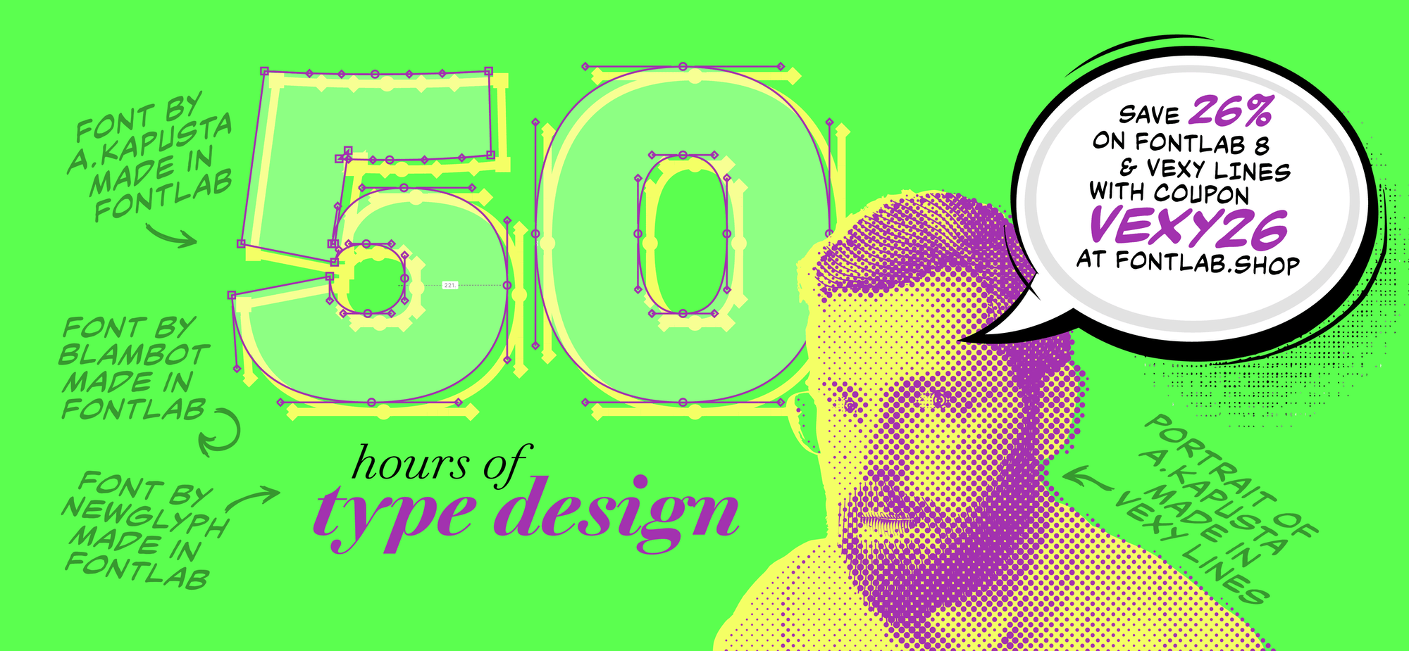
📺 Watch: Basics of spacing on FontLab TV
What it covers
The spacing string. Start with a controlled context — nnHnoHonn, HHOHO, nono — not a sentence. The episode shows why “Hamburgevons” is not enough and what to look for in a real spacing string.
Sidebearings, not pairs. Every spacing problem you can solve with sidebearings, you should. Kerning is for the pairs that nothing else can fix. The video walks through setting n, o, H, O first, then deriving the rest of the lowercase and uppercase from those four anchors.
Round, flat, diagonal, open. Most letters fall into a small number of side-shape categories. Once you know what o does, you know roughly what every round letter does. Once H is set, every flat-sided letter follows. The episode shows the bucketing in practice.
Metric classes. FontLab lets you link sidebearings across glyphs so that one adjustment to n propagates to m, h, u, and so on. The video shows how to set these up and when to break them deliberately.
Why it matters
Bad spacing is the single most common reason a technically competent font feels off. This episode is the cheapest hour you will spend improving every font you make from now on.