Optical sizing's lost century
William Caslon knew something in 1720 that digital type spent a century forgetting: a six-point letter is not a twelve-point letter made smaller.
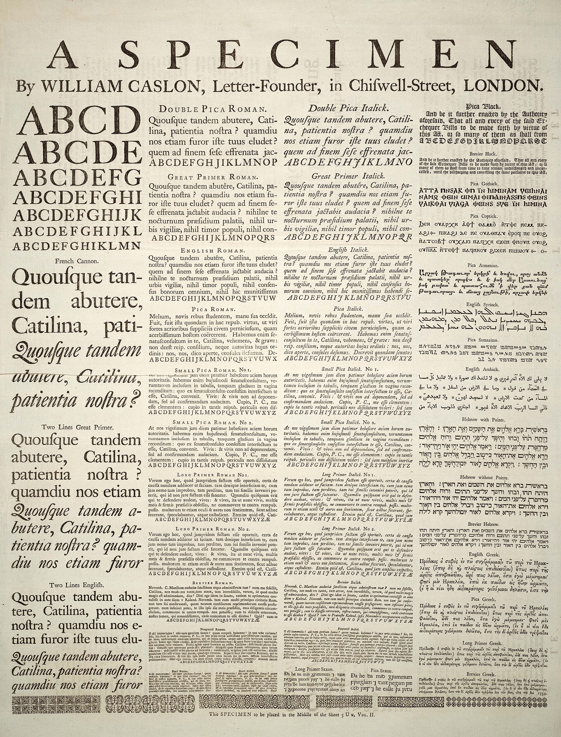
Open Caslon’s 1720 specimen and you see it immediately. Every size of every face is a different drawing. The six-point is thicker, wider, more open — cut from a different punch by a punchcutter who understood that ink squashes and eyes strain at small sizes. The sixty-point is crisper, more refined, its spacing tighter because it can afford to be.
Phototype killed this. One master, photographed up and down. A 72-point headline and a 9-point caption came from the same piece of film, scaled. Nobody at the photo house was cutting a different punch for each size. It was efficient and it looked mediocre and it became the norm.
Digital didn’t fix it. PostScript took the same shortcut. So did TrueType, and most OpenType fonts right up to the variable era.
The opsz axis finally brings it back. Set the axis value to the intended size in points, and the font swaps in shapes drawn for that size — heavier strokes and looser spacing at 6pt, finer strokes and tighter spacing at 60pt. Amstelvar (2017, ranging from 8 to 144pt) and Roboto Flex pioneered the continuous version. Adobe’s Source Serif 4 took a different position in January 2021: five discrete opsz styles rather than infinite interpolation. Frank Grießhammer’s argument was that five carefully drawn sizes beat an infinite number of mediocre ones. Both approaches are defensible.
There is still an unresolved argument over what opsz units actually mean. Physical points? CSS pixels? GitHub issue roboto-flex#104 has been open for years, with Adam Twardoch, Laurence Penney, John Hudson, and Dave Crossland trading positions. It matters more than it sounds: font-optical-sizing: auto is the default in most browsers, and “auto” is doing slightly different things on each platform.
Caslon would have an opinion. He would probably be terse about it.