Beyond the Latin sandbox — global typography
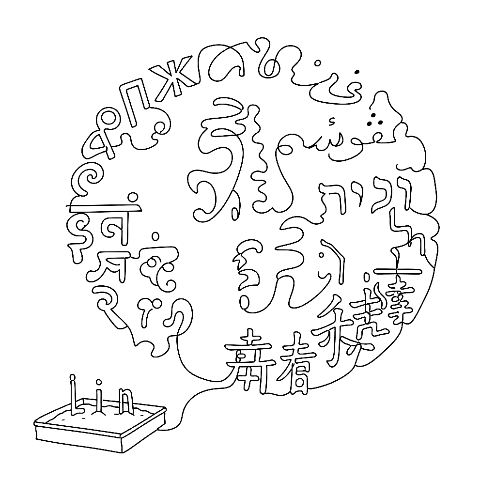
It is a common myopia in Western design to assume that typography begins with A and ends with Z. In reality, Latin script is one small neighbourhood in a vast, complex city of writing systems.
Modern font editors must accommodate the structural realities of Cyrillic, Arabic, Hebrew, Devanagari, and the massive CJK ideographic sets. The technical requirements are demanding. Arabic is inherently cursive and context-dependent — a single letter alters its geometry depending on whether it stands at the beginning, middle, or end of a word, or alone. To draw an Arabic font, the designer must produce these positional variants and lean heavily on contextual alternates (calt) and right-to-left kerning. FontLab 8.2 refined the right-to-left kerning workflow specifically.
Cyrillic carries its own historical and structural baggage. Yury Ostromentsky of CSTM Fonts has written about the subtle but critical differences between Russian and Ukrainian Cyrillic — the Ukrainian Ghe with an upturn, for instance — and Portuguese research at IJUP 2025 specifically tracked the evolution of Ukrainian Cyrillic into modern digital fonts. Localisation is not optional decoration. It is the work.
CJK fonts operate on a different scale entirely. A Latin font might contain 500 glyphs; a comprehensive Chinese or Japanese font requires tens of thousands. Managing that volume routinely crashes lesser software. FontLab 8.4 added robust support for Unicode Variation Sequences, which professional CJK publishing requires for ideograph variants.
Underneath all of this, the design logic of non-Latin scripts deserves the same care as Latin design logic. The font editor must be a neutral container, capable of right-to-left rendering, complex mark attachment, and massive glyph counts without buckling. Imposing Latin assumptions onto Hanzi or Arabic forms is exactly how typography fails internationally.
A font that respects six scripts respects the readers of those scripts. The tools that support all six are how that respect actually ships.