Made with FontLab: Yuri Gordon
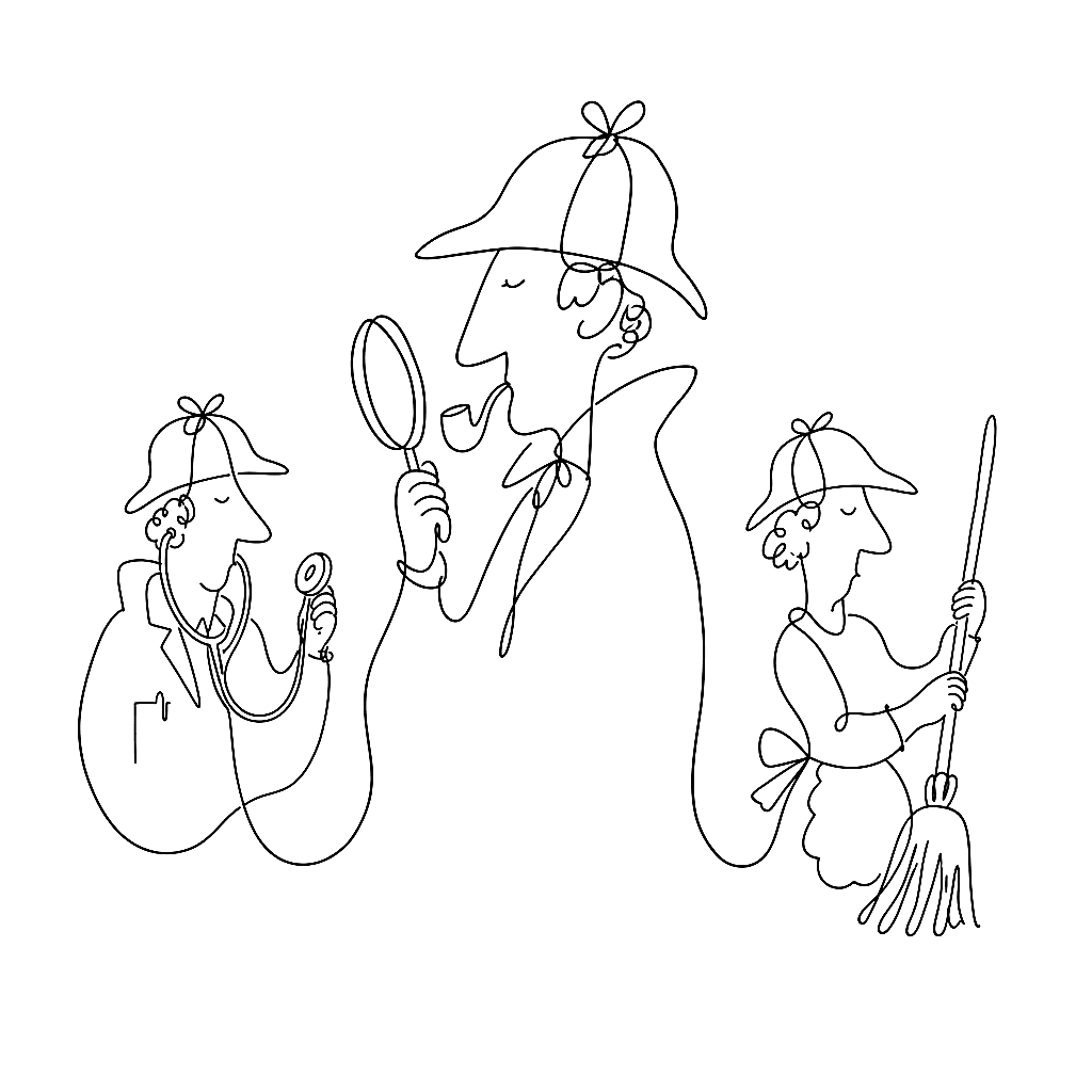
Acqua Aldina is a variable serif drawn by hand. Baker Street 221B is a three-font Sherlockian set with a font for the detective, the doctor, and the housekeeper. Yuri Gordon’s catalogue does not pretend to fit one mood, and he’s open about why FontLab works for the spread.

Gordon’s public catalogue at yurigordon.com covers seven entries on the made-with-fontlab gallery: Acqua Aldina, the three Baker Street fonts (Mr Holmes, Dr Watson, Mrs Hudson), BazaArt, Fleursdumal, and Villon VF. Variable, traditional, display, conceptual — one foundry, no house style imposed on top.
Gordon — a beta tester for FontLab as well as a customer — puts the case for that range cleanly:
FontLab is amazingly flexible. Not only you can choose the most suitable from a set of ready-made tools, but you can also create a full-fledged workspace that’s truly yours: a customized interface with the most convenient set of shortcuts. In FontLab, you can build a traditional serif font, verified to a micron, and just as easily draw a crazy variable font by hand.
Some operations in type design normally are terribly tedious. But FontLab makes them a pleasure, both aesthetically and motorically — for example manual kerning. As a fan and beta tester, I can only shout: Vamos! Força FontLab!

The line worth keeping is “verified to a micron, and just as easily draw a crazy variable font by hand.” The two ends of that sentence are the two ends of professional type design — the meticulous text revival where every node has to land exactly where it lands, and the experimental display variable where the whole point is to throw a designer’s hand at an axis and see what comes out. Most editors are good at one of those. Gordon is making the explicit claim that one tool can be good at both, and that the customisation surface — the layout, the shortcuts, the workspace — is what lets a designer tune the same editor for both jobs.
The “manual kerning is a pleasure” comment is the load-bearing one for working designers. Kerning is the chore everybody complains about. The pairs are uncountable, the work is repetitive, and bad tooling makes it actively painful. Gordon is saying — explicitly, both aesthetically and motorically — that FontLab makes the chore feel good. That’s not a marketing line. That’s a designer telling you that the part of the job everyone hates is, on this tool, the part he doesn’t mind.