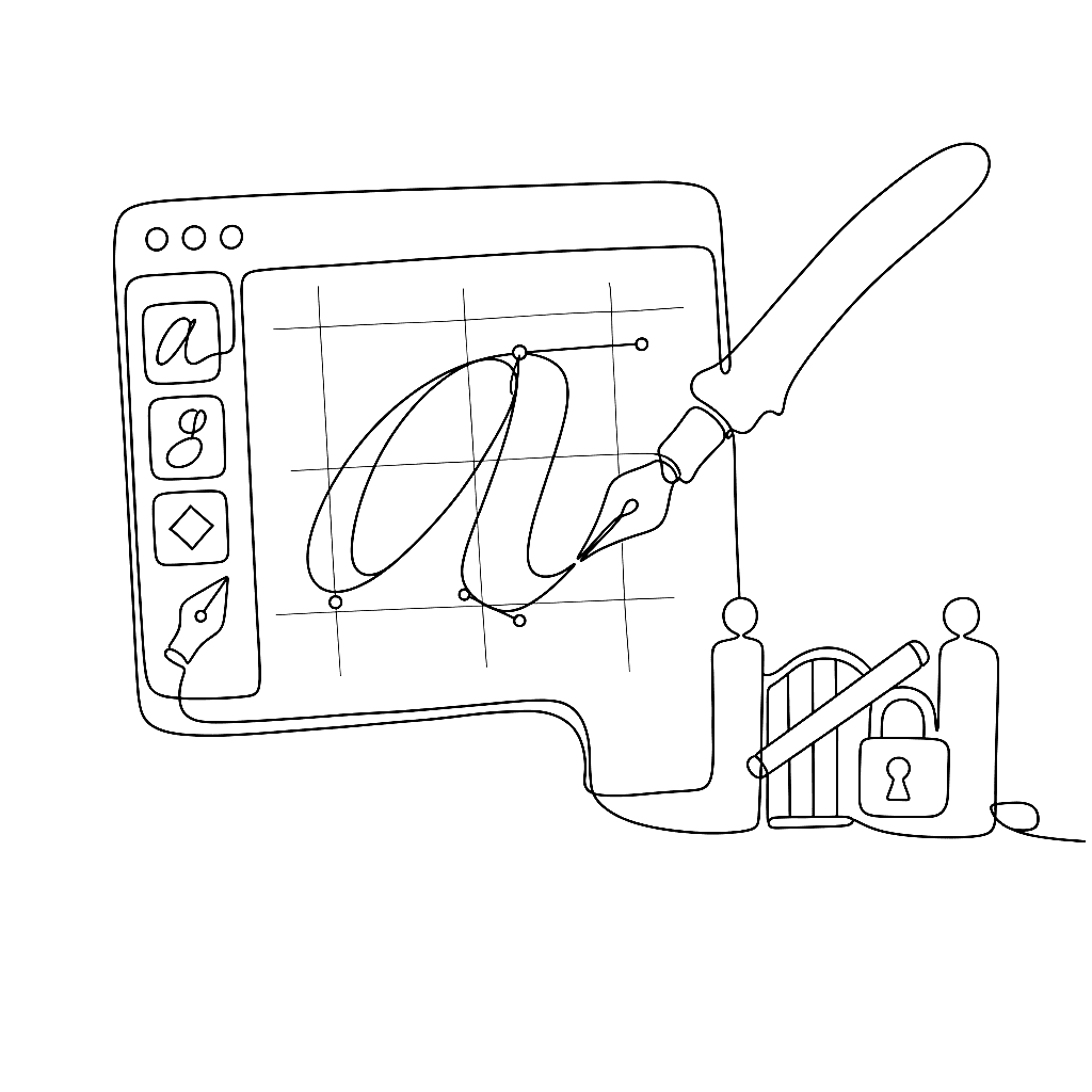
Drawing calligraphic fonts in FontLab: setup and shapes
Dave Lawrence of California Type Foundry wrote a comprehensive set of tutorials for FontLab 8, from installation to finished font. This post distills the first two chapters: getting your environment set up, and the fundamentals of drawing in FontLab’s glyph-oriented workflow.
Getting FontLab 8 running
Installation on Mac occasionally hits a security gate. If macOS blocks the app from opening, go to System Preferences > Security & Privacy > General and allow FontLab at the bottom of the General pane. Alternatively: go to Applications, right-click the .app file, choose Open, then Open again. That clears the flag.
FontLab 8 runs on macOS 10.15 Catalina and later, and Windows 8.1 and later. The free 10-day trial is fully functional — all features, no export restrictions.
Dave recommends importing FontLab’s settings and shortcuts from the provided preset file before you start drawing. The keyboard shortcuts in his tutorials assume these presets are active.
How drawing works in FontLab
FontLab’s structure differs from general vector editors like Illustrator, and the differences matter.
When you create a new font, FontLab shows a Font window — a grid of glyph cells, most greyed out. Think of it as a package: all the drawings that will become your font, organized by character slot. Double-click a glyph cell to open the Glyph window for drawing.
Inside a glyph, shapes live in elements — containers holding one or more contours. FontLab uses a two-arrow system. The black arrow (Element tool) selects and moves entire elements. The white arrow (Contour tool) selects and edits individual nodes and handles inside an element. Using the wrong arrow for the wrong job is the most common confusion for designers arriving from other vector tools.
Elements are reusable. Draw a serif once as an element, attach it to a stem node, and FontLab reuses it across multiple glyphs. Change the serif in one place and every glyph referencing it updates. This reference system makes large-scale font production practical.
The Rapid tool and basic contour drawing
FontLab’s Rapid tool is built for drawing letterforms efficiently. Rather than placing nodes and handles separately, Rapid lets you click to place corner nodes and drag to place smooth curve nodes, with curve direction inferred from the drag. Experienced users draw entire glyphs with fewer tool switches than other editors require.
For calligraphic and brush-style letterforms, the Power Brush draws strokes expanding from a skeleton line — set the brush angle, width, and contrast, then draw freely. The stroke stays editable: change its properties after drawing, or convert to outlines when you’re ready to refine the edges.
The Contour tool (white arrow) handles precision node editing. The Power Nudge feature moves related nodes intelligently when you nudge a selected node — stroke thickness is preserved when moving a node along the stem, so consistency doesn’t break accidentally.
Vector rules for font export
Fonts require closed contours with consistent direction. Outer contours run counter-clockwise; inner contours (counters, the inside of ‘o’) run clockwise. Open paths export as nothing.
FontLab’s FontAudit catches direction errors, open contours, and other problems automatically. Build the habit of drawing closed shapes from the start. When you cut shapes apart and rejoin them — what Dave calls “surgery” — always check that contours are closed and directions are correct before moving on.
Dave Lawrence’s full Calfonts tutorial series continues with spacing, family planning, and italics.
Next in this series: Calligraphic fonts: spacing, italics, and family planning