Calligraphic fonts: spacing, italics, and family planning
Once your letterforms are drawn, the work shifts to spacing, quality control, and — if you’re ambitious — building a family. This post distills Dave Lawrence’s chapters on fitting and spacing, building italic variants, and planning a type family in FontLab 8.
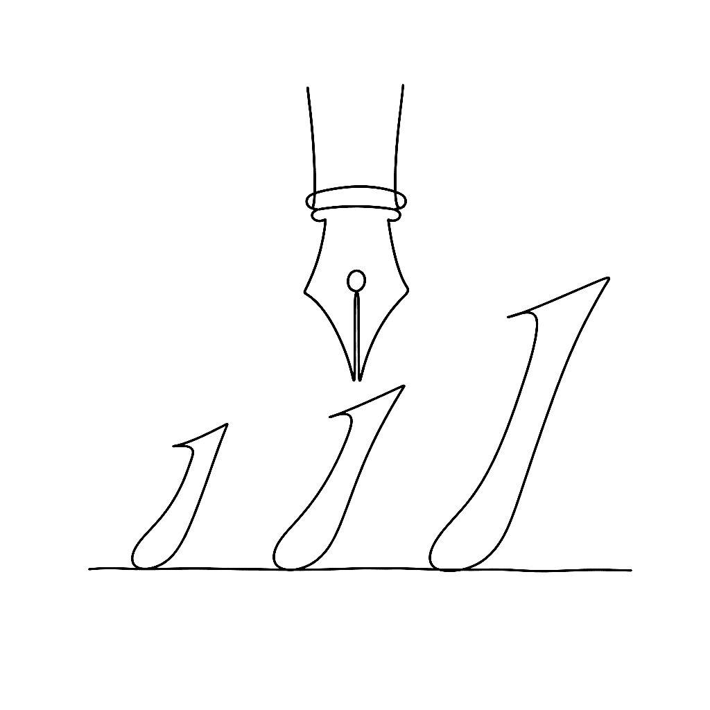
Fitting and spacing: letter heights first
Before setting sidebearings, establish your vertical metrics. FontLab’s font-level dimensions — cap height, x-height, ascender, descender — define the proportional relationships governing the whole typeface. Some are used by applications to position glyphs on the baseline and calculate line spacing.
Dave’s “60 Second Quick Start Metrics” tutorial covers the fastest path to usable spacing: set letter heights in Font Info, then work through the control characters ('n', ‘o’ for lowercase; ‘H’, ‘O’ for caps) in the Metrics window. Drag sidebearing lines with the Metrics tool, or type values numerically. Once the control characters feel right in pseudo-words like “nnonoo”, link other glyphs to them using metrics expressions.
FontLab’s auto-spacing function (Font > Auto Space, or the semicolon key) gives every glyph a starting point at once. It’s not a finished result — the algorithm doesn’t know your design’s intentions — but it eliminates starting from zero on secondary glyphs.
Honing and path fixing
After drawing comes cleanup. Autotrace results, imported SVG artwork, and even carefully hand-drawn contours can contain problems: nearly flat curves that should be straight lines, overlapping paths creating rendering artifacts, contour directions wrong for export.
FontLab’s automatic path fixing (Contour > Auto Fix) handles the most common issues. For manual work, the Eraser tool in toolbox mode removes nodes smoothly, and the Clean Up action simplifies over-complex paths while preserving the outline shape.
The key insight from Dave’s chapter on fixing paths by hand: don’t fix everything at once. Work through problem types one at a time — open contours first, then direction errors, then unnecessary nodes.
Italic design in FontLab
Building an italic usually starts with the roman: select all glyphs, run Tools > Actions > Slant for an oblique starting point, then work through each glyph to make the shapes genuinely italic, not just slanted.
True italics differ from obliques in more than angle. The lowercase ‘a’ typically becomes single-story. The ‘f’ gets a descender. Many letters adopt calligraphic forms distinct from their roman counterparts. How far you push this depends on the typeface’s role — a formal serif italic stays closer to its roman than a loose, humanist one.
Spacing the italic requires one specific check: roman-italic combinations. Technical and academic text mixes roman and italic in the same word. Italic sidebearings need to work against roman neighbors, not just other italic letters. Test by typing mixed-style text in the Metrics window.
Family planning
A font becomes more useful — and more saleable — as part of a family. The minimum viable family is roman + italic, or regular + bold. The maximum is a variable font with continuous axes for weight, width, and optical size.
Dave’s approach: design two masters (regular and bold, or regular and condensed), run Match Masters to make them interpolation-compatible, then generate instances at intermediate positions with Font > Generate Instance. FontLab’s interpolation is the same algorithm used at runtime in variable fonts, so the preview reflects what users see.
For a static family, export each instance as a separate OpenType file and name them in Font Info > Instances. For a variable font, export as Variable TT and users get the full range in one file.
The tutorials go much deeper on each topic. What’s here is the skeleton; the flesh is in the full series.
Dave Lawrence’s full Calfonts tutorial series goes deeper on drawing, spacing, family planning, and italics.
Previous: Drawing calligraphic fonts in FontLab: setup and shapes