
The FontLab book in Korean

Most font editors grew up thinking about Latin. In April 2025, a Korean designer published the book that translates FontLab into Hangul terms.
Most font editors grew up thinking about Latin. In April 2025, a Korean designer published the book that translates FontLab into Hangul terms.


Science Gothic is a four-axis variable font drawn by Thomas Phinney, Brandon Buerkle, and Vassil Kateliev. The fact that it exists at all — full Latin coverage, four axes, a real production pipeline — is partly because Kateliev wrote the toolkit that did the heavy lifting.

The most difficult part of drawing a typeface is not the black ink. It is the white space.


Drop a photo into Vexy Lines, and it hands you back a crisp vector drawing. It reads the brightness of your image and adjusts stroke thickness to match. Dark areas get heavy lines. Light areas get fine ones. It’s simple math, but the results look like magic.

NT$1.5 million in eighty minutes. NT$26 million in the end. A typeface named after a tea proved that East Asian type had an audience willing to pay for it.

Type designers, like every healthy craft community, love a good debate. The forums where they gather — TypeDrawers, r/typography, the various national mailing lists — are full of long, careful, generously-argued threads about exactly the kind of detail that makes a difference at 9pt.

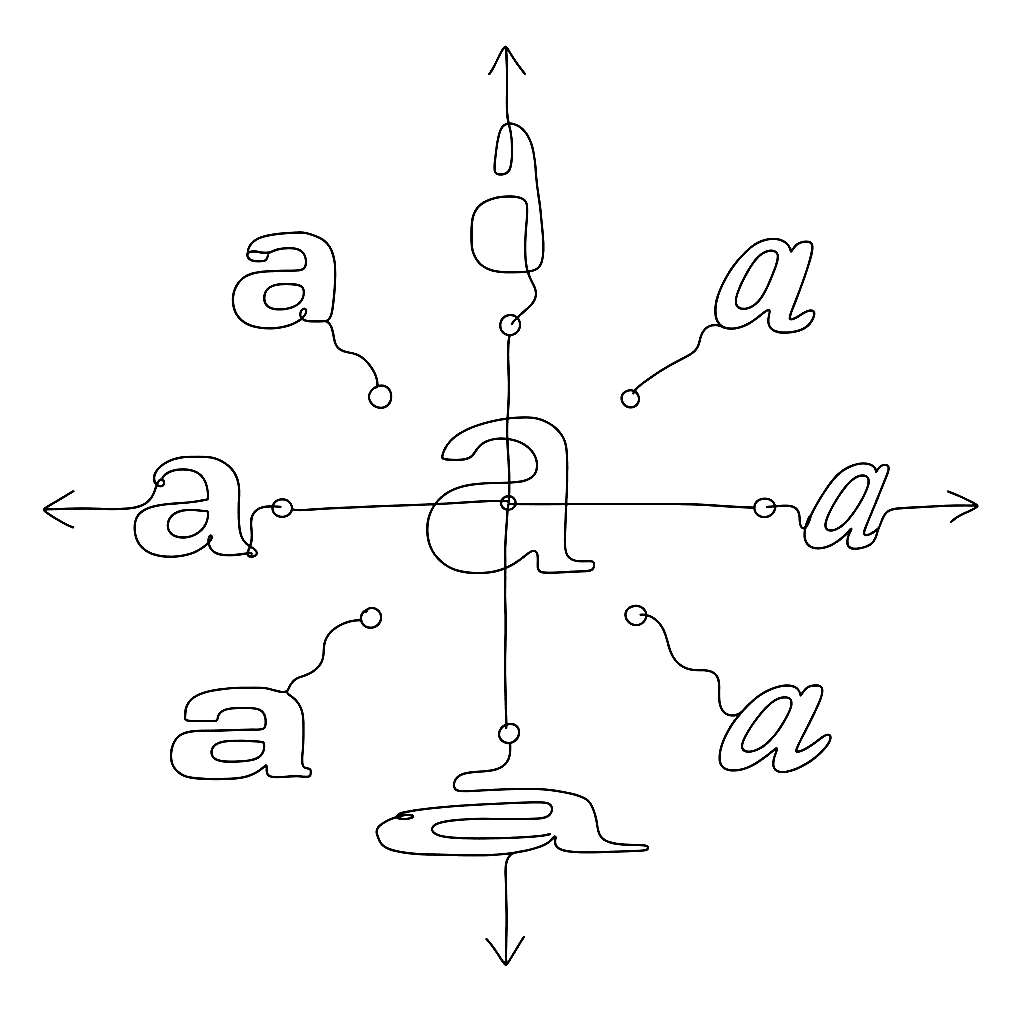
Italic is not roman tilted to the right. Slant your upright a and what you get is a tilted a, not an italic a — the structure is wrong, the rhythm is wrong, the connection points are wrong.
Seven weights. Four regional variants. 65,535 glyphs each — the maximum an OpenType font can hold. Adobe and Google hit the ceiling on purpose.

In April 2025, a Korean book appeared with a modest title and a very specific promise: 폰트랩 타입 디자인 — FontLab Type Design. Its subtitle is even better: “FontLab and Hangul 2780, an enjoyable story.” That is not just a manual. It is a map through one of the hardest jobs in type design.

The problem with Japanese set in Helvetica has annoyed transit designers for fifty years. In January 2017, Akira Kobayashi did something about it.

OpenType features are the part of font design where text becomes typography. The FontLab TV OpenType episode walks through the feature tags you will actually use, what they do at runtime, and how to write them without breaking anything else.

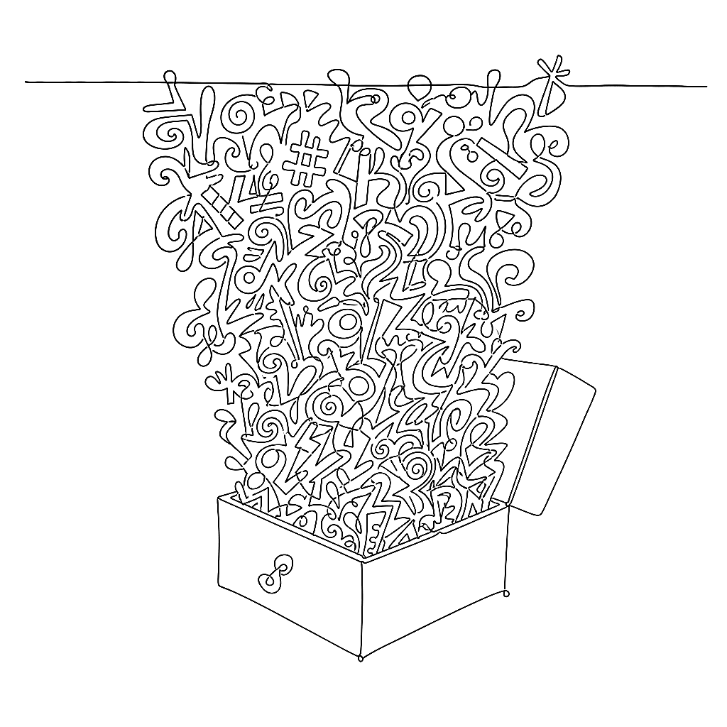
It is a common myopia in Western design to assume that typography begins with A and ends with Z. In reality, Latin script is one small neighbourhood in a vast, complex city of writing systems.

Honing is the part of font design between “I have a sketch” and “I have a glyph that ships.” The Calfonts honing tutorial — adapted here — covers the boring, decisive 80% of drawing: fixing paths automatically where you can, fixing them by hand where you must.

Graduate is the kind of variable font that makes the case for the format without having to argue. Slab to sans, light to black, all in one file. Eduardo Tunni drew it in FontLab.

One of Morisawa’s oldest typefaces made it into Your Name because it was imperfect in exactly the right way.

The Japanese font on your iPhone has been drawn since 1989 by a studio of three people.

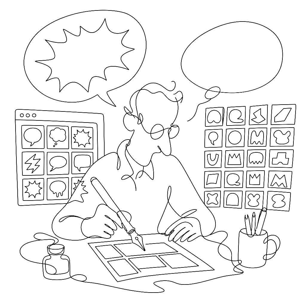
Type spent five hundred years in black and white. Then mobile phones demanded emoji, and four large companies sat down separately and proposed four entirely incompatible ways to put color into a font. The decade since has been an awkward growing-up.

A bold weight is not a thicker version of the regular. It is a different design that has to share a family with the regular and pretend they were drawn together. Briem’s bold tutorial — adapted lightly here — is the cleanest argument for why the obvious approach doesn’t work.

Three names. One style. A 19th-century missionary print shop at the centre of all of them.

In 1958, Paul de Casteljau at Citroën worked out the mathematics of the curves we now draw with every day. A few years later Pierre Bézier at Renault arrived at the same idea independently and published it in 1962.
Design space is the part of variable font work that decides whether your font feels good or merely works. The FontLab TV design space episode is the conceptual foundation for everything you do with masters, axes, and instances.

The story everyone tells is that Shigetaka Kurita designed emoji at NTT Docomo in 1999. It is a good story. It is also wrong.

In 2021 the Television Academy gave the W3C a Technology & Engineering Emmy for font standardisation on the web. Among the recipients was the CEO of FontLab Ltd — a small, deeply satisfying acknowledgement that the work to make type travel cleanly across browsers, operating systems, and broadcast pipelines mattered enough to be celebrated alongside cinematography and sound design.

Variable fonts are not new. They are the third attempt at the same idea, by mostly the same engineers, after twenty-five years of finding out what didn’t work.

William Caslon knew something in 1720 that digital type spent a century forgetting: a six-point letter is not a twelve-point letter made smaller.

A variable font isn’t a new file format. It’s an OpenType file with a few extra tables nailed on, and once you know what each one does, the whole thing stops being magic.
If you’ve read a comic in the last twenty years, you’ve read Blambot. Nate Piekos’s foundry has supplied the lettering fonts for an absurd share of the medium — the dialogue balloons, the SFX, the display titles. Five of his Blambot families sit in the public made-with-fontlab gallery, all drawn in FontLab 7.

The fashionable take is that variable fonts are not about file size. The fashionable take is wrong, or at least wrong by half.

Christian Robertson drew Roboto in 2011 for Android. Ten years later, David Berlow’s team turned it into something with thirteen knobs.

Color fonts have stopped being a novelty and started being a deliverable — emoji, branded display faces, multi-layered display work. The FontLab TV color font episode covers the four formats you actually have to think about and which to ship for which target.