Emoji is older than you think

The story everyone tells is that Shigetaka Kurita designed emoji at NTT Docomo in 1999. It is a good story. It is also wrong.

The story everyone tells is that Shigetaka Kurita designed emoji at NTT Docomo in 1999. It is a good story. It is also wrong.

In 2021 the Television Academy gave the W3C a Technology & Engineering Emmy for font standardisation on the web. Among the recipients was the CEO of FontLab Ltd — a small, deeply satisfying acknowledgement that the work to make type travel cleanly across browsers, operating systems, and broadcast pipelines mattered enough to be celebrated alongside cinematography and sound design.

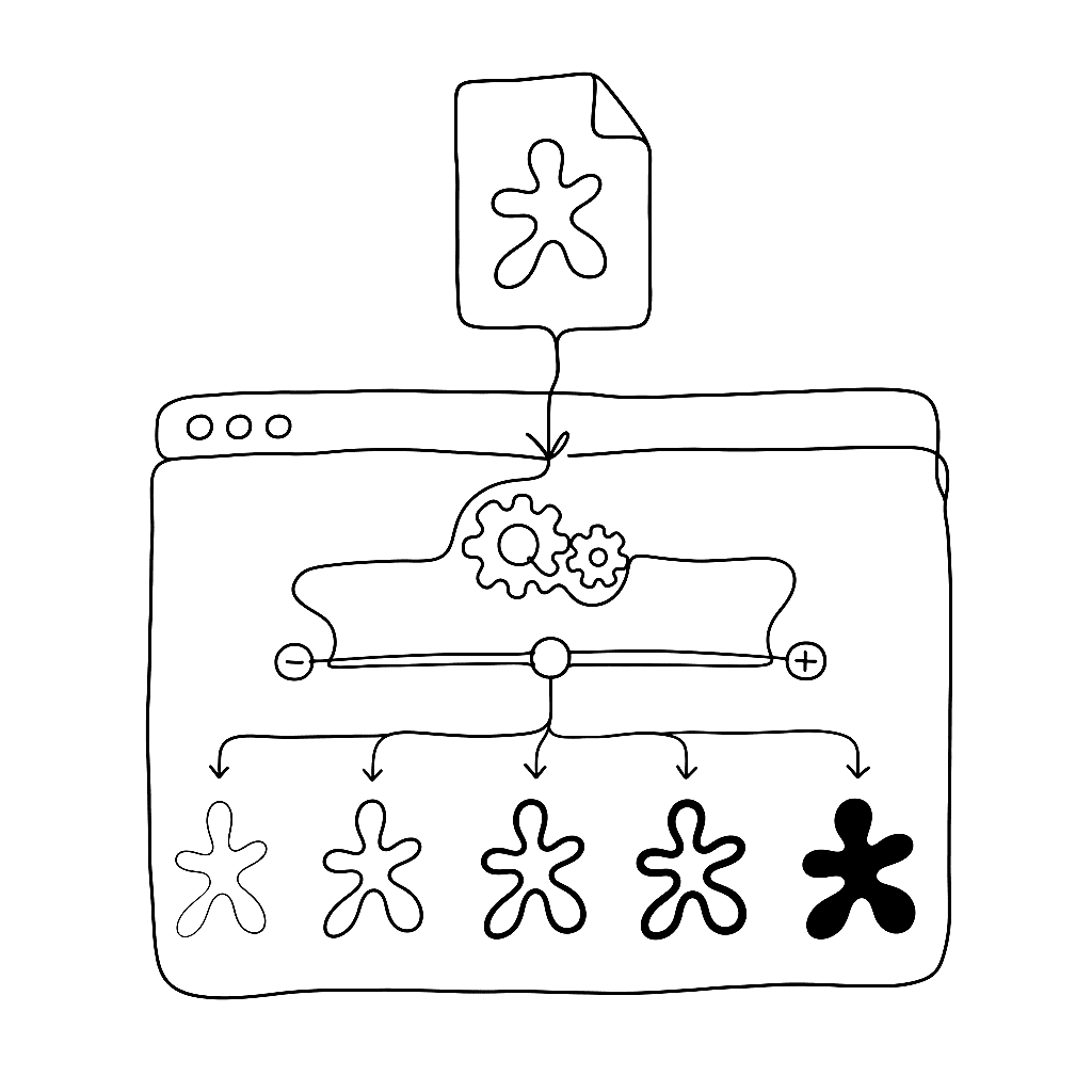
Variable fonts are not new. They are the third attempt at the same idea, by mostly the same engineers, after twenty-five years of finding out what didn’t work.

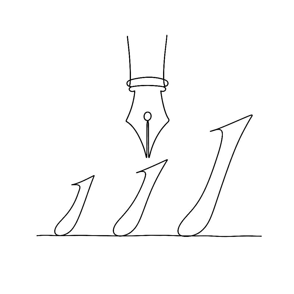
William Caslon knew something in 1720 that digital type spent a century forgetting: a six-point letter is not a twelve-point letter made smaller.

A variable font isn’t a new file format. It’s an OpenType file with a few extra tables nailed on, and once you know what each one does, the whole thing stops being magic.

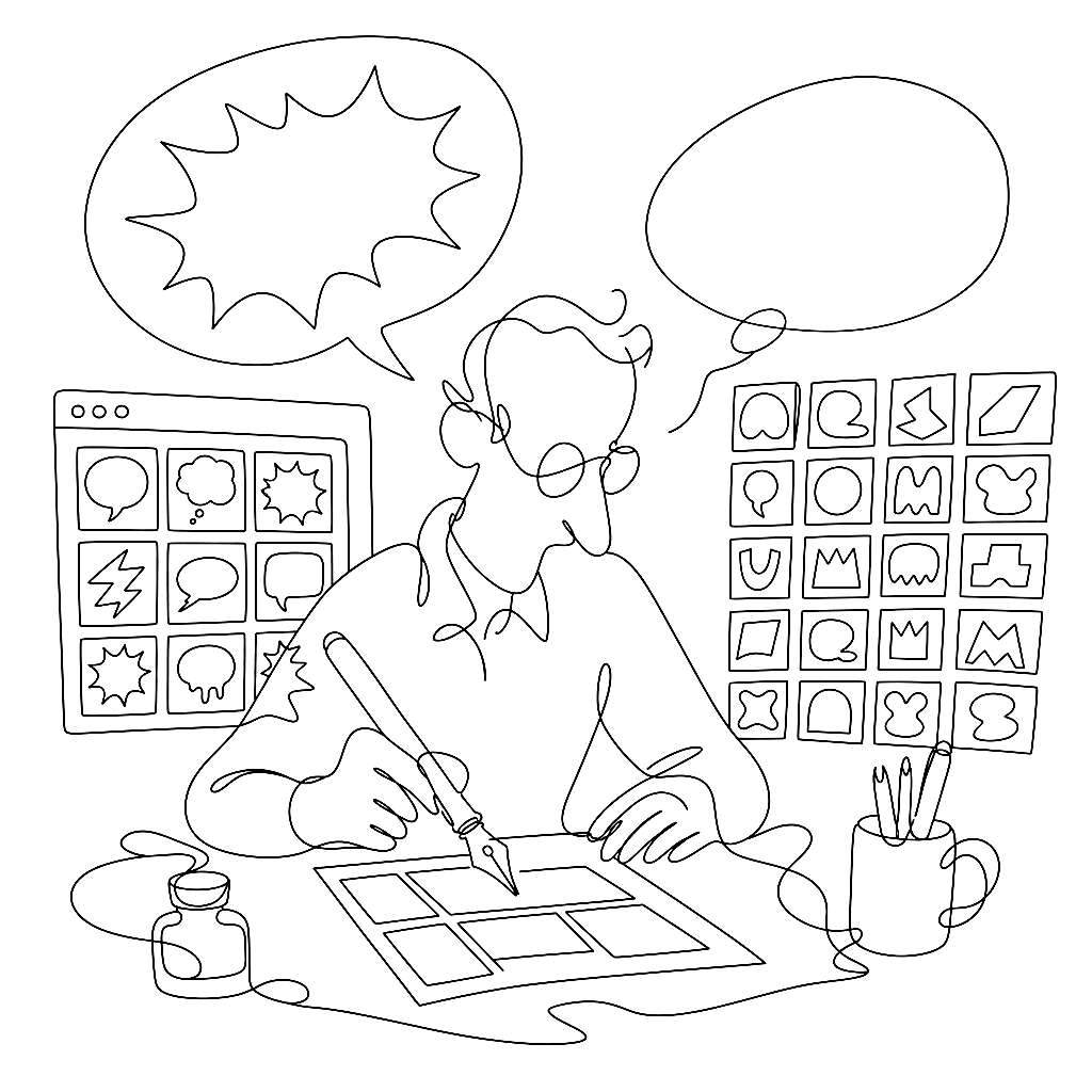
If you’ve read a comic in the last twenty years, you’ve read Blambot. Nate Piekos’s foundry has supplied the lettering fonts for an absurd share of the medium — the dialogue balloons, the SFX, the display titles. Five of his Blambot families sit in the public made-with-fontlab gallery, all drawn in FontLab 7.

The fashionable take is that variable fonts are not about file size. The fashionable take is wrong, or at least wrong by half.

Christian Robertson drew Roboto in 2011 for Android. Ten years later, David Berlow’s team turned it into something with thirteen knobs.

Color fonts have stopped being a novelty and started being a deliverable — emoji, branded display faces, multi-layered display work. The FontLab TV color font episode covers the four formats you actually have to think about and which to ship for which target.

Once your letterforms are drawn, the work shifts to spacing, quality control, and — if you’re ambitious — building a family. This post distills Dave Lawrence’s chapters on fitting and spacing, building italic variants, and planning a type family in FontLab 8.

Bananas is a casual brush face that is mostly an excuse to grin while you set it. Ronaldson Pro is a 19th-century revival that took years to draw and exists because Patrick Griffin would not let the original die. Both are Canada Type. Both came out of FontLab.

If you are still drawing every accented letter by hand, this is the episode that retires that habit. Anchors plus components mean you draw a and acute once, and FontLab assembles aacute, acircumflex, agrave, and the other 700-odd accented forms for you.

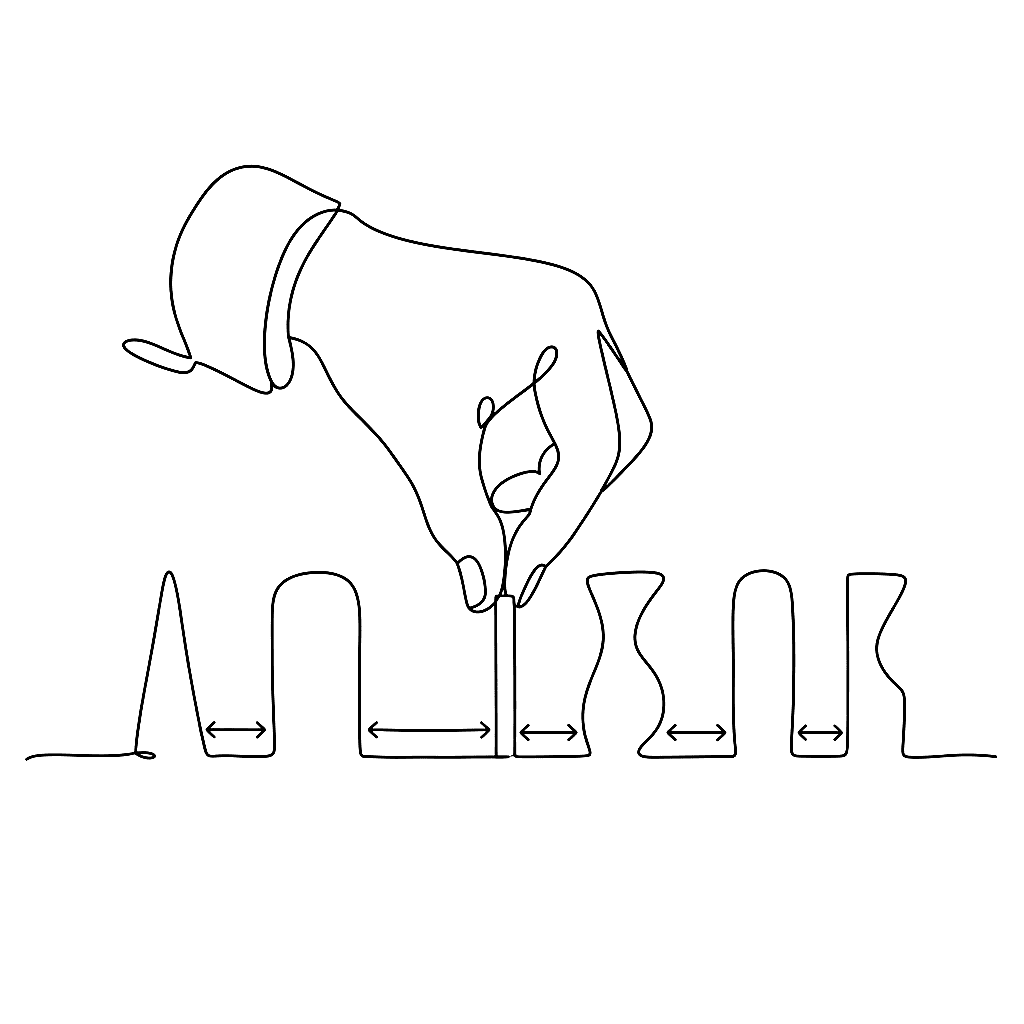
Spacing is what separates a font that exists from a font that reads. The FontLab TV spacing episode is the one to watch first — before kerning, before OpenType, before anything else that can mask bad sidebearings.

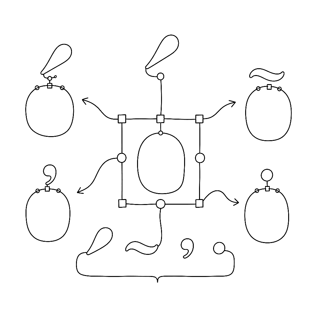
Most readers never notice when typography is right. They only notice when reading feels like work. The features that decide which side of that line a font lands on are mostly the unglamorous ones — kerning, standard ligatures, contextual alternates — the parts that handle the friction the user never sees.

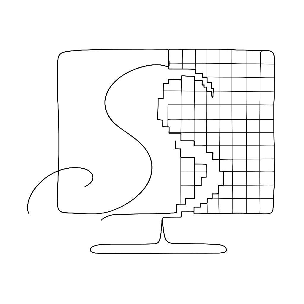
You can spend six months refining the curvature of a lowercase ‘s’, and then your font gets rendered onto a generous grid of pixels on someone’s second monitor at 1366 × 768. Translating a smooth Bézier into that grid is one of the more delicate handovers in typography, and the people who built the tools that handle it have been wonderfully inventive about it.

Bodoni Casale is not a Bodoni revival in the careful, museum-conservator sense. It’s three Bodoni revivals — Casale, Ferrara, Terracina — each a different printed source, each digitised at the level of detail that only matters when somebody looks at the page from six inches away. That’s the California Type Foundry house style, and Dave Lawrence does it in FontLab.

Type design is an art form. Font production is a factory job. Once the aesthetic decisions are settled on the core alphabet, you face the unglamorous reality of propagating those decisions across hundreds — sometimes thousands — of glyphs. Doing that by hand is a recipe for repetitive strain injury and existential dread.

Dave Lawrence of California Type Foundry wrote a comprehensive set of tutorials for FontLab 8, from installation to finished font. This post distills the first two chapters: getting your environment set up, and the fundamentals of drawing in FontLab’s glyph-oriented workflow.

YFF Becha looks like a poster you’d find tacked behind a bar in Lviv — heavy, slightly off, deliberately so. It’s the kind of display face that does not pretend to be neutral, and it’s drawn by Alexander Kapusta at his one-person foundry, Your Font Fetish.

Drawing letters for a living turns out to be mostly an exercise in being perpetually disappointed by optical illusions. A geometric circle next to a geometric square at the same height looks smaller than the square. The fix is to draw the circle slightly larger so that it merely looks the same size. Type design is a profession built on quietly lying to the eye so the eye perceives the truth.

The standard method for digitising a font is to draw the outline. You map the exterior boundary of the shape with Bezier curves, and you push and pull nodes until the silhouette behaves. This works fine for rigid sans-serifs. For a script font, it feels like sculpting in oven mitts.

Letterforms are made of black shapes, but type is judged by the white around and inside them.

You inherit a folder of old PostScript Type 1 fonts. Or a client sends a family with broken names, duplicate glyphs, and kerning that only works in one app. You need web fonts that load fast and look right everywhere.

Since the FontLab 8.2 release in August 2023, two major free updates have shipped: 8.3 in December 2023 and 8.4 in June 2024. Together they add over 200 new features and improvements. Here is the short version.

Three chapters from Gunnlaugur SE Briem’s notes on type design cover the work that comes after the roman is drawn: making a bold weight, designing the italic, and spacing the result. All three are harder than they look and more forgiving than they seem.

Digital formats rarely retire on their own. New ones arrive, the world picks them up, and the older format is gradually sunsetted by the companies that built it. PostScript Type 1 followed exactly that arc, and TransType 4 has been the friendly moving van ever since — keeping the typefaces inside those old files alive on modern systems.

FontLab 8 supports every current color OpenType format and ships with Python 3.11 scripting and the TypeRig library. This post covers the color workflow and scripting capabilities from the “Color” and “Scripts & extensions” chapters of the What’s New documentation.

The hardest part of designing a typeface isn’t drawing — it’s deciding. Which letterforms? How wide? How much contrast? Gunnlaugur SE Briem’s notes on decisions and modules offer two complementary approaches: systematic variation and comparison, and learning from masterpieces.

FontLab 8.2 lands with around 250 changes on top of 8.0 — a consolidation release that touches every corner of the app, from the Sketchboard to the export dialog. Drawing tools get smoother handles and snappier strokes; kerning learns to read right-to-left; the COLR format reaches v1; Python moves to 3.11; and a quietly redesigned UI makes large fonts feel lighter to work with. Free for FontLab 8 owners.

Variable fonts pack an entire type family into one file, letting users slide continuously between weights, widths, and other axes rather than jumping between predetermined styles. FontLab 8 treats variable font creation as a first-class workflow, not a post-production step. Here’s what the “Families & variation” chapter of the What’s New documentation covers.