
From bland to bold: turning any image into a vector with Vexy Lines
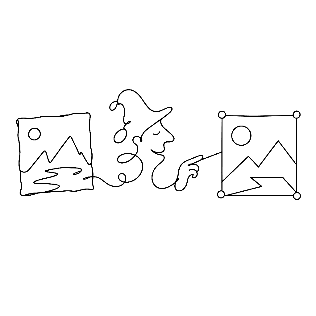
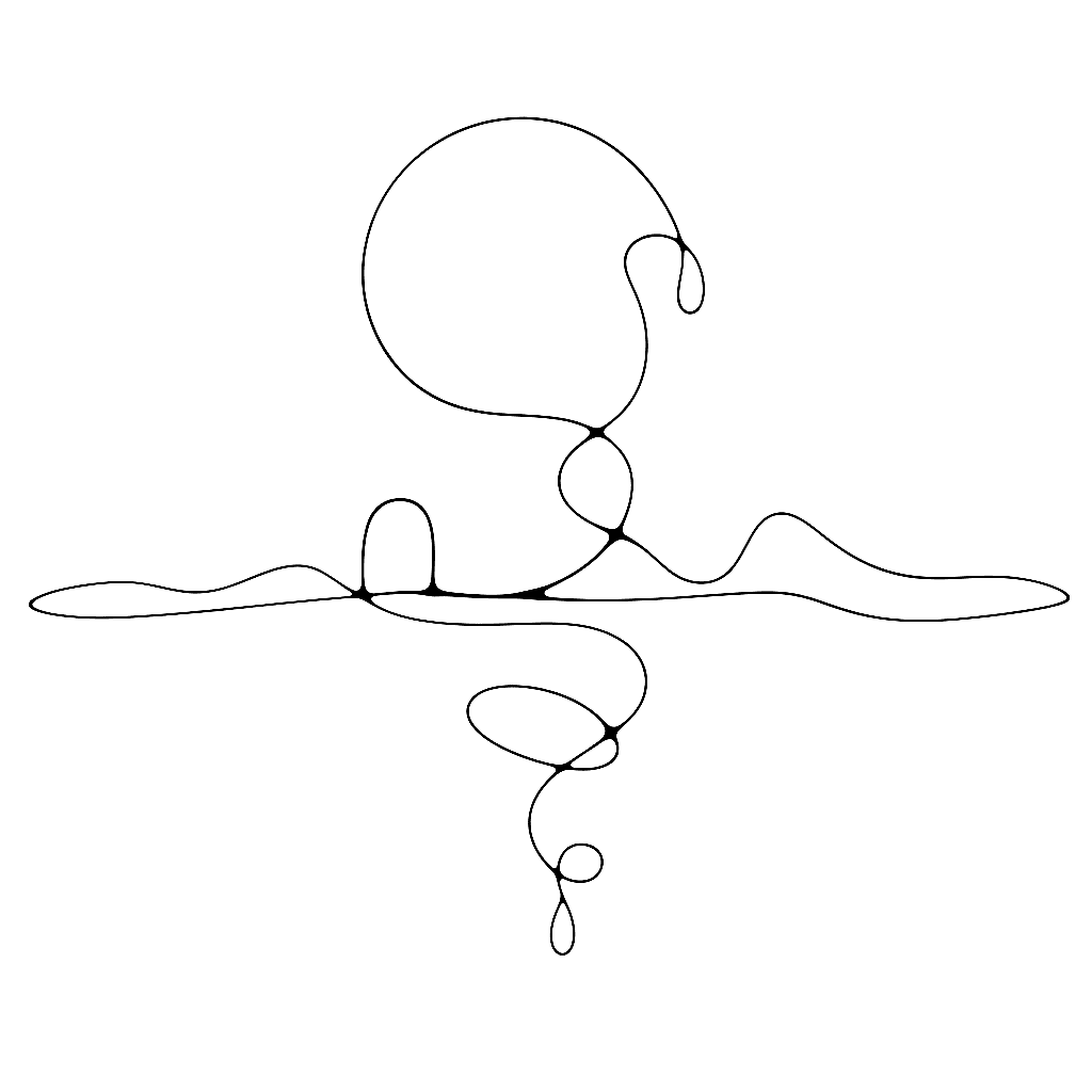
A photograph is not a vector. A sketch is not a vector. A scanned logo is definitely not a vector. Vexy Lines exists to fix that, one image at a time.
FontLab is our flagship font editor for Mac and Windows that helps you create fonts from start to finish, from a simple design to a complex project, and brings a spark of magic into type design.
A photograph is not a vector. A sketch is not a vector. A scanned logo is definitely not a vector. Vexy Lines exists to fix that, one image at a time.
Typography on screen used to mean “pick a weight and hope for the best.” Now the weight can follow the user.
Every OpenType feature — ligatures, kerning, small caps, Arabic joining forms — runs through two tables and one engine. Most type designers know the features exist. Fewer know what the tables look like from the inside.

Most type designers know their fonts will be rendered differently on macOS and Windows. Fewer know the names of the four pieces of plumbing responsible. The names are worth knowing, because the plumbing shapes everything.
The first letter is the hardest. The FontLab TV glyph construction episode is a calm, deliberate walkthrough of drawing one letter — n — from a blank glyph cell to a finished, point-clean contour you can build a font around.
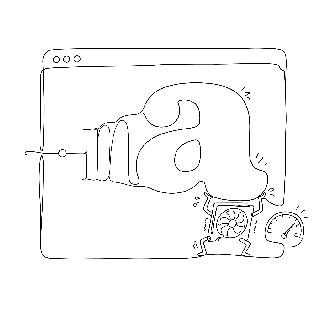
Browsers have shipped robust font-variation-settings support since 2018, and animating those axes works the way the rest of CSS animation works. That is a small miracle, and the people who built it deserve a round of applause.
A colour font with one palette is a coloured drawing. A colour font with thirty palettes is a theme system. The difference is CPAL, and most people walk right past it.

In 2013, four companies each decided the same thing: OpenType needed color. They each decided it differently.
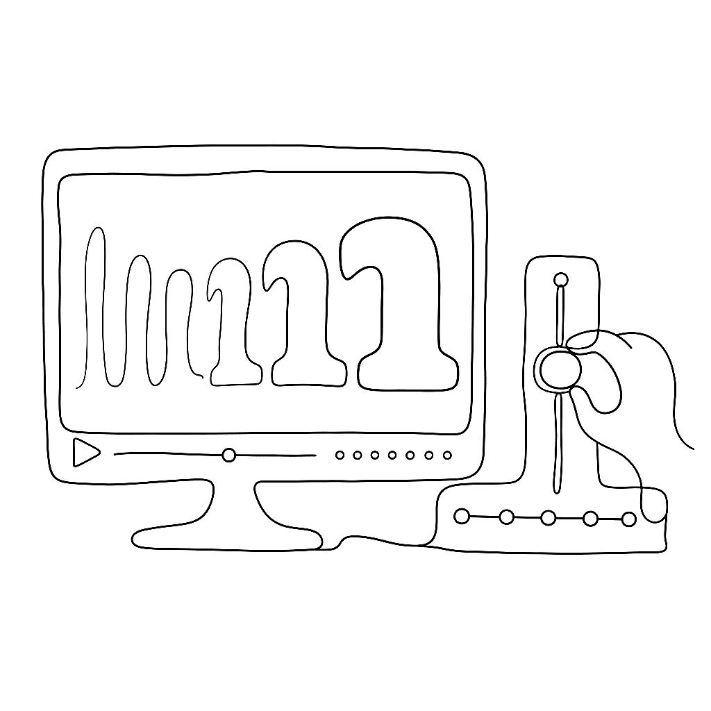
FontLab TV has published a 50-hour video course on variable font design, organized into 25 playlists. It runs from absolute fundamentals — coordinates, contours, metrics — through production, hinting, export, and font business basics.

Six programmes shape almost everyone working in type design in 2026. All six are small. Most are slow by design.

Most of the world’s text passes through a library most people have never heard of.

If you read Korean on a phone, you are almost certainly reading a Sandoll typeface. That is not an accident — it is four decades of infrastructure work.
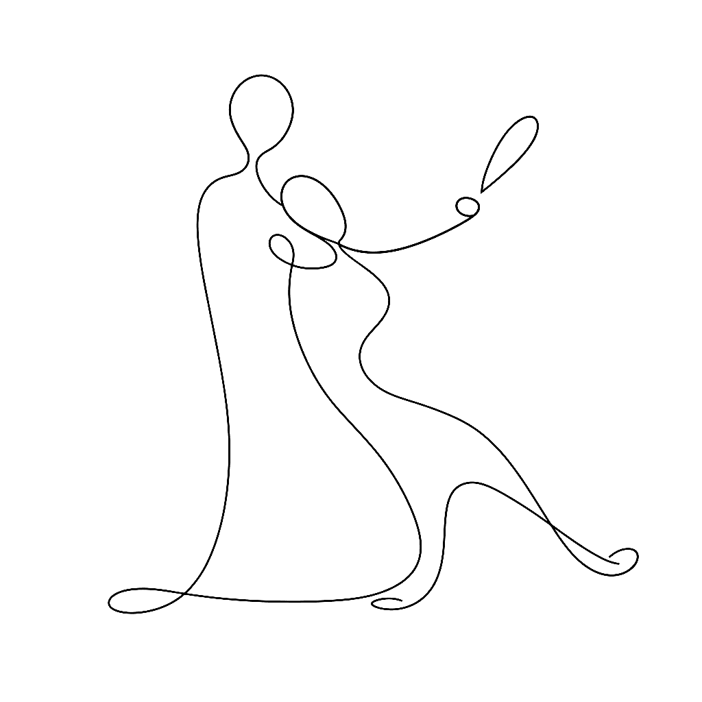
Italics are the part of a font family that most often gets shipped wrong — slanted romans, no cursive structure, lopsided ovals. The Calfonts italic tutorial walks through what it actually takes to draw an italic that earns its place next to the roman.

King Sejong personally invented the Korean alphabet in 1443. Its instruction manual was lost for four centuries, then carried through the Korean War inside a man’s coat.

Most font editors grew up thinking about Latin. In April 2025, a Korean designer published the book that translates FontLab into Hangul terms.
The most difficult part of drawing a typeface is not the black ink. It is the white space.

NT$1.5 million in eighty minutes. NT$26 million in the end. A typeface named after a tea proved that East Asian type had an audience willing to pay for it.
Italic is not roman tilted to the right. Slant your upright a and what you get is a tilted a, not an italic a — the structure is wrong, the rhythm is wrong, the connection points are wrong.
Seven weights. Four regional variants. 65,535 glyphs each — the maximum an OpenType font can hold. Adobe and Google hit the ceiling on purpose.
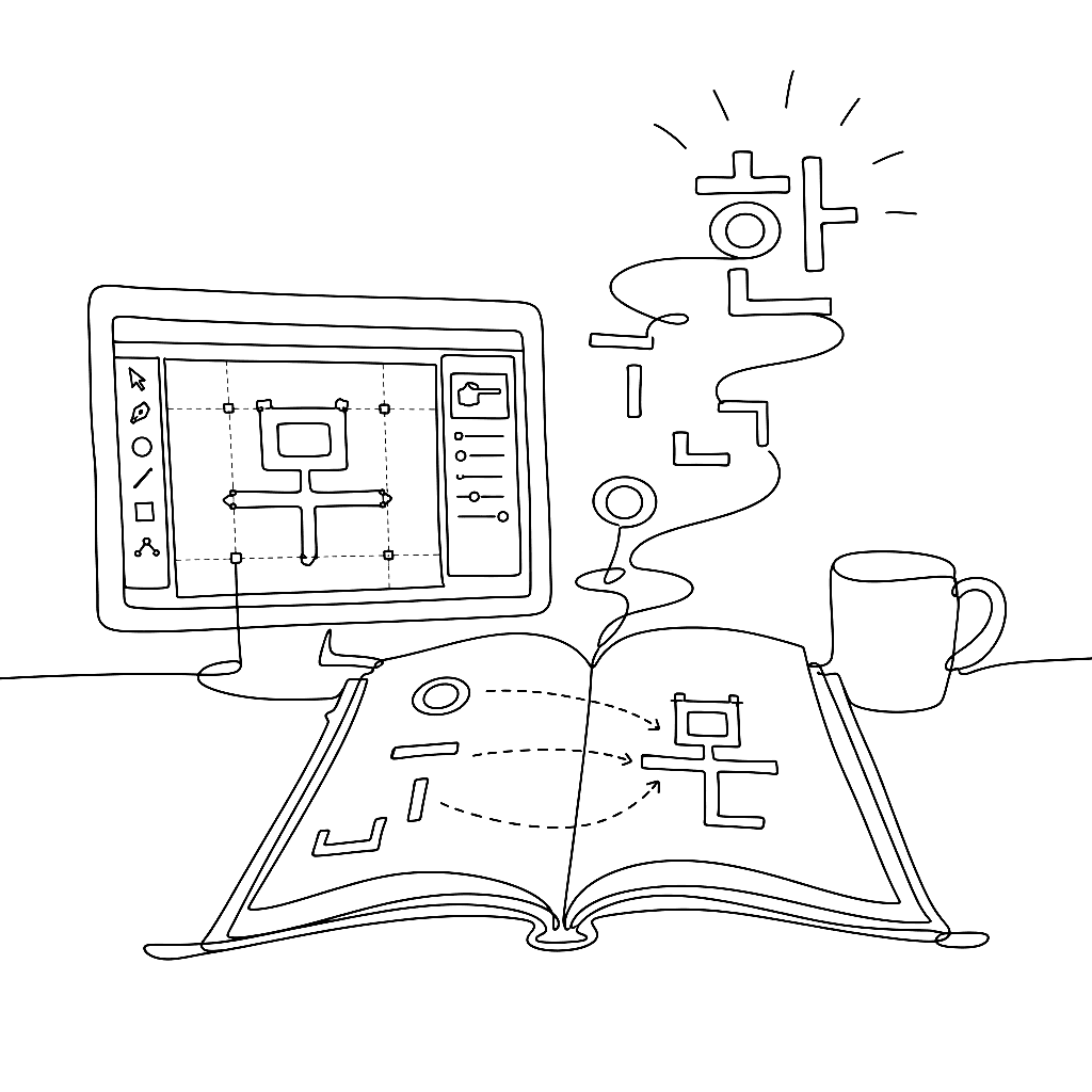
In April 2025, a Korean book appeared with a modest title and a very specific promise: 폰트랩 타입 디자인 — FontLab Type Design. Its subtitle is even better: “FontLab and Hangul 2780, an enjoyable story.” That is not just a manual. It is a map through one of the hardest jobs in type design.
The problem with Japanese set in Helvetica has annoyed transit designers for fifty years. In January 2017, Akira Kobayashi did something about it.
OpenType features are the part of font design where text becomes typography. The FontLab TV OpenType episode walks through the feature tags you will actually use, what they do at runtime, and how to write them without breaking anything else.
It is a common myopia in Western design to assume that typography begins with A and ends with Z. In reality, Latin script is one small neighbourhood in a vast, complex city of writing systems.
Honing is the part of font design between “I have a sketch” and “I have a glyph that ships.” The Calfonts honing tutorial — adapted here — covers the boring, decisive 80% of drawing: fixing paths automatically where you can, fixing them by hand where you must.
One of Morisawa’s oldest typefaces made it into Your Name because it was imperfect in exactly the right way.

The Japanese font on your iPhone has been drawn since 1989 by a studio of three people.

Type spent five hundred years in black and white. Then mobile phones demanded emoji, and four large companies sat down separately and proposed four entirely incompatible ways to put color into a font. The decade since has been an awkward growing-up.

A bold weight is not a thicker version of the regular. It is a different design that has to share a family with the regular and pretend they were drawn together. Briem’s bold tutorial — adapted lightly here — is the cleanest argument for why the obvious approach doesn’t work.

Three names. One style. A 19th-century missionary print shop at the centre of all of them.
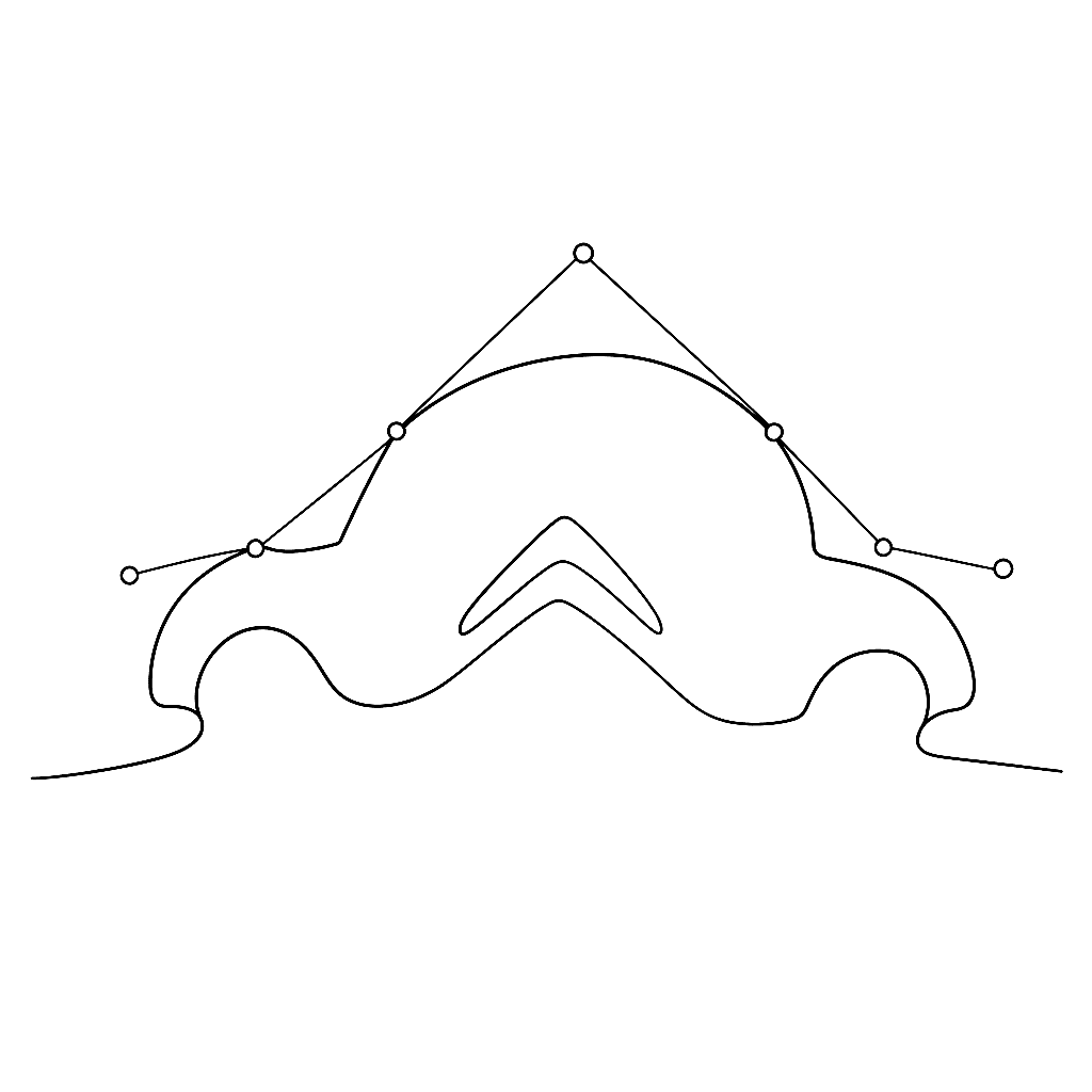
In 1958, Paul de Casteljau at Citroën worked out the mathematics of the curves we now draw with every day. A few years later Pierre Bézier at Renault arrived at the same idea independently and published it in 1962.