Skip to content

FontLab

FontLab

FontLab TV: design space basics
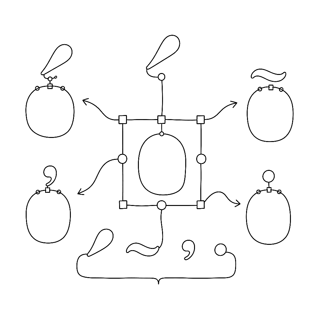
Design space is the part of variable font work that decides whether your font feels good or merely works. The FontLab TV design space episode is the conceptual foundation for everything you do with masters, axes, and instances.


FontLab

WOFF, WOFF2, and the Emmy that crowned web type

In 2021 the Television Academy gave the W3C a Technology & Engineering Emmy for font standardisation on the web. Among the recipients was the CEO of FontLab Ltd — a small, deeply satisfying acknowledgement that the work to make type travel cleanly across browsers, operating systems, and broadcast pipelines mattered enough to be celebrated alongside cinematography and sound design.

FontLab

FontLab TV: color fonts without tears

Color fonts have stopped being a novelty and started being a deliverable — emoji, branded display faces, multi-layered display work. The FontLab TV color font episode covers the four formats you actually have to think about and which to ship for which target.

FontLab

Calligraphic fonts: spacing, italics, and family planning

Once your letterforms are drawn, the work shifts to spacing, quality control, and — if you’re ambitious — building a family. This post distills Dave Lawrence’s chapters on fitting and spacing, building italic variants, and planning a type family in FontLab 8.

FontLab

FontLab TV: anchors, components, and accented glyphs

If you are still drawing every accented letter by hand, this is the episode that retires that habit. Anchors plus components mean you draw a and acute once, and FontLab assembles aacute, acircumflex, agrave, and the other 700-odd accented forms for you.

FontLab

FontLab TV: spacing letters from scratch

Spacing is what separates a font that exists from a font that reads. The FontLab TV spacing episode is the one to watch first — before kerning, before OpenType, before anything else that can mask bad sidebearings.

FontLab

OpenType features as invisible UX

Most readers never notice when typography is right. They only notice when reading feels like work. The features that decide which side of that line a font lands on are mostly the unglamorous ones — kerning, standard ligatures, contextual alternates — the parts that handle the friction the user never sees.

FontLab

Hinting and screen testing: the craft of small sizes

You can spend six months refining the curvature of a lowercase ‘s’, and then your font gets rendered onto a generous grid of pixels on someone’s second monitor at 1366 × 768. Translating a smooth Bézier into that grid is one of the more delicate handovers in typography, and the people who built the tools that handle it have been wonderfully inventive about it.

FontLab

Scripting the mundane: letting Python do the dishes

Type design is an art form. Font production is a factory job. Once the aesthetic decisions are settled on the core alphabet, you face the unglamorous reality of propagating those decisions across hundreds — sometimes thousands — of glyphs. Doing that by hand is a recipe for repetitive strain injury and existential dread.

FontLab

Drawing calligraphic fonts in FontLab: setup and shapes

Dave Lawrence of California Type Foundry wrote a comprehensive set of tutorials for FontLab 8, from installation to finished font. This post distills the first two chapters: getting your environment set up, and the fundamentals of drawing in FontLab’s glyph-oriented workflow.

FontLab

The heavy machinery of FontLab 8.4

Drawing letters for a living turns out to be mostly an exercise in being perpetually disappointed by optical illusions. A geometric circle next to a geometric square at the same height looks smaller than the square. The fix is to draw the circle slightly larger so that it merely looks the same size. Type design is a profession built on quietly lying to the eye so the eye perceives the truth.

FontLab

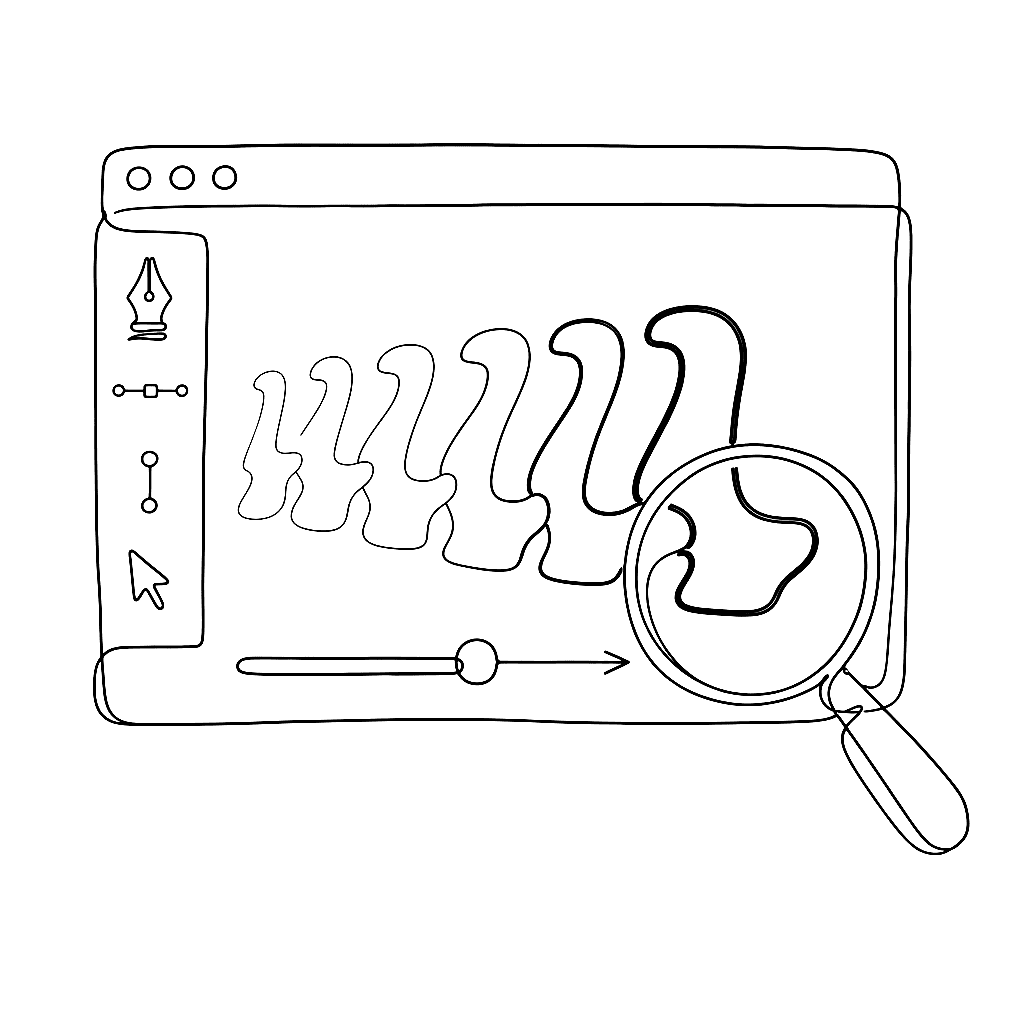
Ghosts in the machine — drawing with strokes

The standard method for digitising a font is to draw the outline. You map the exterior boundary of the shape with Bezier curves, and you push and pull nodes until the silhouette behaves. This works fine for rigid sans-serifs. For a script font, it feels like sculpting in oven mitts.

FontLab

FontLab 8.3 and 8.4: what's new

Since the FontLab 8.2 release in August 2023, two major free updates have shipped: 8.3 in December 2023 and 8.4 in June 2024. Together they add over 200 new features and improvements. Here is the short version.

FontLab

Briem on spacing, italics, and the bold weight

Three chapters from Gunnlaugur SE Briem’s notes on type design cover the work that comes after the roman is drawn: making a bold weight, designing the italic, and spacing the result. All three are harder than they look and more forgiving than they seem.

FontLab

Color, scripts, and color-font formats

FontLab 8 supports every current color OpenType format and ships with Python 3.11 scripting and the TypeRig library. This post covers the color workflow and scripting capabilities from the “Color” and “Scripts & extensions” chapters of the What’s New documentation.

FontLab

Briem on type design decisions

The hardest part of designing a typeface isn’t drawing — it’s deciding. Which letterforms? How wide? How much contrast? Gunnlaugur SE Briem’s notes on decisions and modules offer two complementary approaches: systematic variation and comparison, and learning from masterpieces.

FontLab

Hello, FontLab 8.2

FontLab 8.2 lands with around 250 changes on top of 8.0 — a consolidation release that touches every corner of the app, from the Sketchboard to the export dialog. Drawing tools get smoother handles and snappier strokes; kerning learns to read right-to-left; the COLR format reaches v1; Python moves to 3.11; and a quietly redesigned UI makes large fonts feel lighter to work with. Free for FontLab 8 owners.

FontLab

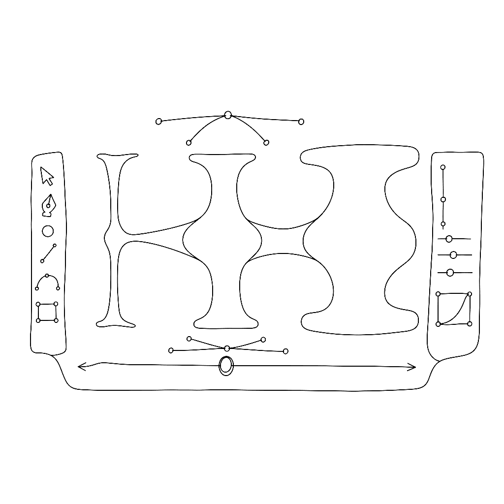
Variable fonts in FontLab 8

Variable fonts pack an entire type family into one file, letting users slide continuously between weights, widths, and other axes rather than jumping between predetermined styles. FontLab 8 treats variable font creation as a first-class workflow, not a post-production step. Here’s what the “Families & variation” chapter of the What’s New documentation covers.

FontLab

Briem's typography lessons: foundations

Gunnlaugur SE Briem taught type design at the Royal Academy of Fine Arts in Copenhagen in 1996. His notes from that course — precise, practical, free of mystification — have been republished with permission on the FontLab documentation site. Here is a distillation of his opening chapters on why you’d make a font and what the basics actually require.

FontLab

Hello, FontLab 8

Two years into FontLab 7, users had a clear message: the drawing engine is excellent, the variable font support is solid, now make the rest of the application match. FontLab 8, shipping today, is our answer.

FontLab

FontLab 7.2.0.7644 and macOS 12.3 Monterey

Apple’s macOS 12.3 Monterey update broke all previous versions of FontLab 7 by removing the system Python 2.7 that FontLab depended on. FontLab 7.2.0.7644 is a free patch that restores compatibility — macOS 12.3 users need to install a bundled Python 2.7 package alongside the app. A buggy intermediate build (7650) that made glyph fills transparent was withdrawn; 7644 does not have that problem.

FontLab

Make your variable fonts better with FontLab 7

This 19-minute presentation by Adam Twardoch, delivered at ATypI Tech Talks 2021, goes beyond building variable fonts to the harder question: making them good. It covers quality assurance, interpolation checking, and the tools in FontLab 7 and related applications that help catch problems before a variable font ships.

FontLab

FontLab 7: a year in updates

FontLab 7 launched in December 2019 with over 250 new features. Twelve months later, it has rather more than that. Here is what the 2020 update cycle actually delivered — not counting FontLab 7.2, which has its own post.